Wednesday, December 30, 2009
Sunday, December 27, 2009
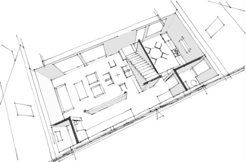
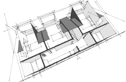
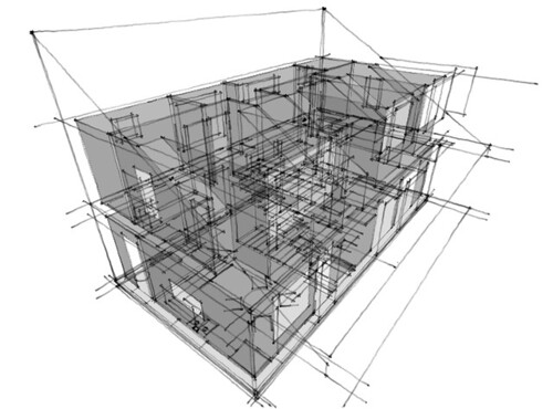
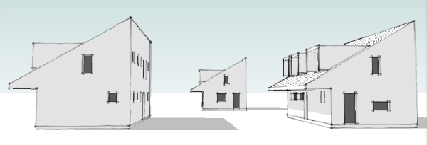
Contest House trio
Posted by
lavardera
at
12/27/2009 08:46:00 PM
0
comments
![]()
Saturday, December 26, 2009
Contest House - solar orientation, street orientation
Orienting a house design to the sun is easy. But put it on a small urban/suburban site, introduce a street grid, suddenly everything may not be going your way.
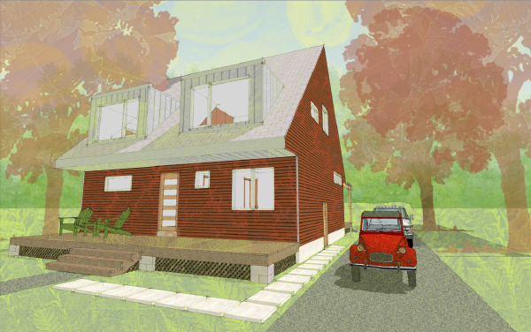
We admit that we've designed ourselves into this corner to a degree. We've made a decision to use an asymmetrical massing for the house which in turn dictates which way the house massing must be oriented for the sun. Its not completely a fabrication however as the asymmetrical profile does serve the small footprint of the house allowing us to make a 1.5 story design on a narrow dimension. But it does impose restrictions such as the dictate on solar orientation. Working with such limits introduces compromises which can be at once necessary and pleasing as they can create unexpected quirks or complexities to a design. And so we have here with our Lagom House as we strive to create variations on the design to accommodate different site orientations while maintaining the necessary solar orientation.
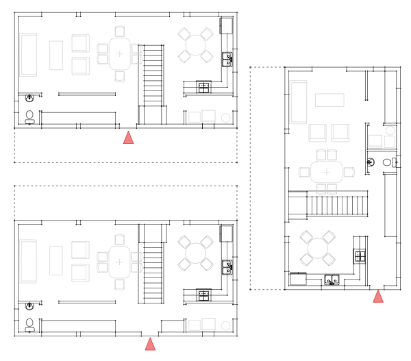
I've hinted at this in the past posts on the design process as I've been developing all three versions of the house concurrently, yet I've been using only one to share the progress of the design. So new we have three prototypes, two for streets running roughly east west, one for the north side of the street with the sloped roof facing the street, and one for the south side with the sloped roof facing the rear yard. The third version for north south streets slopes the roof towards the side yard.
The south side version is what we've been looking at, so lets look at how the floor plan shifts for the north side. The ground floor plan is essentially the same except for the flip of the relative direction of the stair. The front door shifts slightly towards the living room, and the foot of the stair is now right beside the entry foyer. This is not at all a bad arrangement and still retains the ability to step up and through the landing and proceed to the kitchen. A little bit more subtle is the change in orientation for the bedrooms, now facing the front yard rather than the back yard. This is not a great compromise in privacy, but some people may have a distinct preference.
The east west version makes greater compromises. First the plan never really makes an complete change over to the narrow deep orientation as it still relies on access to a reasonable side yard. The kitchen retains a door now on the side of the house, and the living areas dual doors are now shared one on the side and one to the rear. The entry consumes a good portion of the "service corridor" portion of the floor plan in this scheme. While there is a bit more storage as a result the home office area and utility room suffer for the loss of space to the foyer. It is possible that some of the mechanical equipment could find a place under the stair or in the new storage cabinets running on the outside wall between the kitchen and living room, but I did not want to assume that while laying out the plan.
Continue reading "Contest House - solar orientation, street orientation"
Posted by
lavardera
at
12/26/2009 01:58:00 PM
5
comments
![]()
Tuesday, December 22, 2009
Contest House - upstairs, the bedrooms
We've shown the development of the massing and the ground floor plan, but before we proceed to the solar orientation variations on the house we need to look at the second floor.
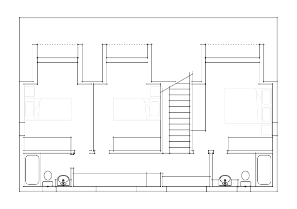
Each bedroom includes a dormer that extends the area of the room to a tolerable size. These are not big bedrooms - they are for sleeping, really not much room for a lot more than that. I think the closet space is good however, and if done with a wardrobe unit it can eliminate the need for a freestanding dresser which there is not really room for. If you can do that you will have room a chair by the window. At the top of the steps is a large window with a window seat. This may or may not be desirable depending on your site, but its a nice opportunity for a unique sitting place that makes the house live larger. Also in the upstairs hall is the kids homework desk - a long affair wide enough to manage two kids, computers, and crafts. Some space is reserved for a hall linen cabinet as well. Then we have two bathrooms at opposite ends of the house. The hall bath for the kids, and the slightly larger bath off the master bedroom. The hall also can provide access to an attic level HVAC unit if needed. The attic space is not large, but can provide needed mechanical space depending on the mix of equipment you need for your region.
So there is the basic second floor arrangement.
Continue reading "Contest House - upstairs, the bedrooms"
Posted by
lavardera
at
12/22/2009 06:20:00 PM
1 comments
![]()
Saturday, December 19, 2009
Contest House - having our cake and eating it too.
Discussion on the previous post led me to work the floor plan some more seeking to gain back the legitmate laundry + utility room, and the ground floor powder room we believe Americans will demand.
Just not comfortable with the combination powder room + laundry + utility room from the first go round of the floor plan, we dove back in to see where we could possibly trim fat. Well the answer it seems was staring us in the face, and that was the 16 feet of available desktop space in the home office area. Now 16ft would be great, especially if you wanted to accommodate two people. But we will have an upstairs "homework" desk for the kids so we don't have to have space for them here. Plus having a legitimate kitchen table also makes a great place to do homework. So we resolved to carve a tiny powder room out of the home office.
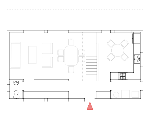
The result is still over 12ft of desktop length. Certainly enough for two people, or the option to have a vertical storage cabinet. The powder room is small and will require a tiny wall hung sink, but a small compromise really. Meanwhile back on the other side of the plan we have the old combo space now completely dedicated to laundry and utilities. I'm relived that I can make more space here because it widens the options for HVAC systems. This is important if people want to include a solar water heating system or AC air handler or whatever is appropriate for their climate. Side by side rather than stack laundry is also possible if your HVAC needs only one piece of equipment. We can also gain an entry door through the laundry + utility room, which is not something everybody wants or needs, but if you like that direct access its great that you can have it in this small floor plan.
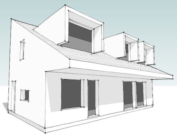
The developing massing model is a bit more informative than the prior wire-frames. The next step is revisiting the alternate floor plans. With the massing of the house having such a definitive solar orientation we now have to consider the situation where the house could be on the other side of the street. In other words facing the wrong way for our solar platform. We also have to consider street orientation - currently it works on a street running east west, but how about north south streets. We need a variation that has a front door on the end of the house.
Continue reading "Contest House - having our cake and eating it too."
Posted by
lavardera
at
12/19/2009 02:20:00 PM
4
comments
![]()
Wednesday, December 16, 2009
Contest House - comparing plans
The compact size of our proposed design triggers a series of compromises. We look at the plan of the typical Swedish catalog house to see if we can gain any insight.
Part of our effort to keep the footprint of the contest house design small also limits our options. We want the living spaces to feel spacious and open, yet our experience is that running any interior room from side to side in a house actually contributes to it feeling smaller. Somehow the presence of a "space beyond" where you are, or a "space between" here and there can contribute to a home feeling perceptually larger. When a house is small this becomes an important consideration.
I've placed the plan of the Anebyhus Lygnern design above the sketch of our contest house plan. The first thing we notice is that the Swedish house is essentially a 1 story design with two bedrooms on the ground floor. Officially it is what the Swedes call a 1.5 design, or a one story house with the option for the finishing of the second floor. That option would add 3 bedrooms, a bath, and a common family room to the home effectively doubling its size. With the upstairs finished the house tops out at around 2000sqft, 33% more than our target of 1500 sqft.
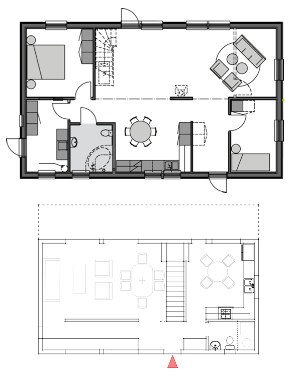
Yet there are significant things going on in the Swedish plan that save space. Things that are considered floor plan "poison" in the US. These are not criticisms of the Swedish design, but rather highlights of different cultural expectations in the US and Sweden. First of all the master bedroom shares its bathroom with the secondary bedroom - no private master bath. Compounding this is the bathroom is also doing duty as a powder room for guests. The second bedroom is also awkwardly located right at the entry foyer. Now if the second floor was completed, all of these issues resolve - the second bedroom becomes an ideal home office. But we will still find only one shared bathroom upstairs. Yet all of this shared bathroom saves space and makes for the opportunity for a very useful utility/laundry room. This is something that we are forced to sacrifice in order to create a first floor powder room. Utilities and laundry relegated to a closet in the same space - not a flexible solution. The American expectation for a master bathroom, and the awkwardness of sending a guest upstairs to find a bathroom puts us in the difficult position to provide 2.5 baths in a compact 1500 sqft home. Yet if we can package these desires into a plan at this size we've put good value and greater market appeal into a small house.
Continue reading "Contest House - comparing plans"
Posted by
lavardera
at
12/16/2009 12:11:00 PM
7
comments
![]()
Tuesday, December 15, 2009
Contest House - first sketches
I've begun sketching out the massing of the house - wireframe drawings posted
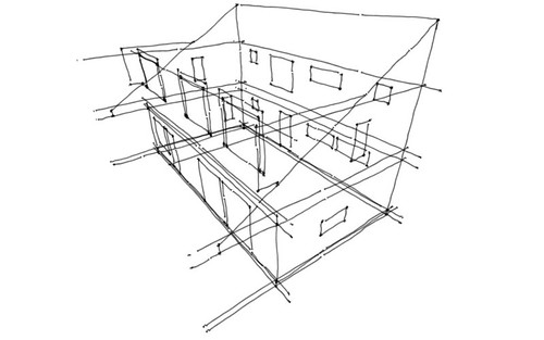
I am planning on using a single slope roof with the intention of the house facing sunward, so that the upper portion of the roof slope can form a platform for solar collectors. Its functional, but also a design element - overtly stating its purpose through its form. Solar collectors could be placed on a conventional roof profile but that would make less of a statement. Scott and I are having a bit of a debate about this right now. He feels that profile is too much "design statement" and not enough "design solution". We don't agree here, and I acknowledge that the kind of modern houses in the Swedish catalogs are much more modest in their architectural exuberance. Yet compared to the range of wild design themes often used for high end modern houses, and the quietness of authentic vernacular homes, I do think I'm striking a good balance. Not only here but in the design themes of most of our house plans.

I'd love to hear readers opinions on this. I know there is not much here to react to yet, but you could look back to the XHouse3 for example and have the same discussion. If we want modern to live in the mainstream of home building in the US, what is the proper level of design? How far do we push it, how extreme or modest is going to be successful in the wider market?
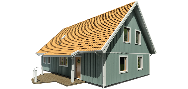
example of swedish modern/traditional (MoTrad) house: Anabyhus Lygnern
Continue reading "Contest House - first sketches"
Posted by
lavardera
at
12/15/2009 11:54:00 AM
2
comments
![]()
Sunday, December 13, 2009
Contest house - owner profile and our guiding principle
The Who's Next contest did not provide a list of rooms or size for the home, but rather a profile of the owners leaving the contestants to determine the appropriate response.
We are really left to make the size of the house as we see fit which should elicit a interesting range of responses from contestants. We have elected to use the "Starter House" profile offered by the organizers. The profile tells us the owners will have 1 or 2 children, so we are going to take that as a need for a 3 bedroom house. We want to keep the house compact, and to us that means pushing the boundaries of what we already offer in our catalog. So our goal is to make this home design smaller than any other 3 bedroom house in our collection. In keeping with the idea of a "starter house" we are shooting for 1500 sqft. A home office is called for in the profile but to hit our target size its doubtful we can fit a home office the size of a 4th bedroom. There are many more factors from the profile, some of which we may or may not be able to satisfy within the size limit we are imposing. But that is our choice and points towards what will be our guiding principle for the design.
Scott Hedges introduced us to a Swedish concept, an idea that does not have a single word representation in English. The word is "lagom" (sounds like La-Gom) and in Sweden this is an idea which underlies much of the culture and disposition of the Swedish people. An adjective, lagom means roughly "just the right amount" or "just enough is best". Its a sentiment of appropriateness as well as modesty, quite the polar opposite of the driving motivation in the US of more is (almost) always better. We don't have a word for this idea, because we basically never think this idea. Scott described it to me well:
"The idea of Lagom as I understand it is that it means “the right amount” or more accurately “an optimal amount” … but this doesn’t get it either … Lagom conveys the notion of having just what you need and no more. It means more than just what is good for you, but good in a more expansive and considerate sense. It is the idea that nothing should be added and nothing should be taken away. "
That last thought really hits it home for me. Nothing added, nothing taken away. It suggests virtue in balance, and balance to me is a driving concept of sustainability, not just in building, but in living.
So with Scott's encouragement I want to endeavor to make lagom the driving principle of this design. As an idea it was not completely unfamiliar to me. I believe that there is a parallel sentiment in the community of people that have driven the revival of modern houses over the past 10 years - what I call the ReModern Movement. Way back when Dwell magazine first started and I was spending so much time on their first internet messageboard there was a strong consensus about what having a modern house meant to the people that came there looking for homes. It was not a simple aesthetic choice, or style choice. To these people a modern home meant moving towards a simpler and more manageable lifestyle. A choice that would bring you a fresh start to concentrate on what was important to you, and to brush aside the baggage and associations of past ideas of what constituted "home". It was a lifestyle choice that would enable you by lightening the burden of creating, maintaining, and paying for a traditional image of home. Instead replaced by a simpler, cleaner, easier living home - something that did not make demands on you so much as serve you in your pursuit of life. It was not the pursuit of the modern home as an extraordinary trophy, but rather the desire for the modern home as ordinary in every sense.
We never had a word for that idea. But lagom comes pretty close, pretty close indeed.
Continue reading "Contest house - owner profile and our guiding principle"
Posted by
lavardera
at
12/13/2009 04:31:00 PM
2
comments
![]()
Designing a new house for a contest
We have begun working on a new house for a design contest we've entered called Who's Next and sponsored by house plan publisher FreeGreen.

Regular readers of our blog may remember that our 0751 RS House design is sold through FreeGreen's Open Source house plan market, and not here on our own site. Open Source is a great way for architects to get into the house plan business, and we've been supportive of the marketplace as a way to make good design more available via houseplans. And that brings us to the design contest. Unlike most design competitions Who's Next does not use anonymous submissions. Anonymity is usually used to rule out bias in judging, but what is lost is a great promotional opportunity. What this means is that I can share my work on my entry here on the blog and you can watch the entire process of the design coming together over the next few months. There is no requirement that we keep our work under wraps till the contest is over in order to hold anonymity. Whether we win the contest or not the design will find its way into our plan collection.
The competition offers two profiles for the hypothetical occupants. The first is called a "Starter Home" for a young couple with plans for 1 or 2 children. The second is for a couple with grown children with plans to retire in the house. Also on the agenda is to use sustainable and green design principals for the house designs. We are expected to choose one of the two profiles and work towards a solution for that scenario. While its an interesting contest we also have our own agenda to bring to the table, and in fact we are using the contest as an excuse to work through a number of issues that have been central to the ideas discussed here on the blog.
The first idea will be to create a compact and efficient house design that we see as being the way forward in the post-housing bust world. This is something we've begun promoting through our XHouse collection and we see this contest entry eventually fitting in to that plan group.
The second issue will be to specifically address sustainable building practices in our design, and eventually our plan set. We've always taken the approach that our house plans were ready to accept emerging green tech, but left this open ended. The contest entry will be more demonstrative, and the specifics will find their way into the Construction Prints.
And finally this contest entry will be our first practical application of some of the building techniques from Sweden that we have been studying and reporting about on the blog here. Our correspondent from Sweden, Scott Hedges, is going to be consulting to us and giving us feedback on how to apply some of their practices here.
Watch here for updates on the design process.
Continue reading "Designing a new house for a contest"
Posted by
lavardera
at
12/13/2009 02:51:00 PM
2
comments
![]()
Saturday, December 12, 2009
0751 RS House - foundation work
After a delay work is underway again at the site of the NJ RS House.
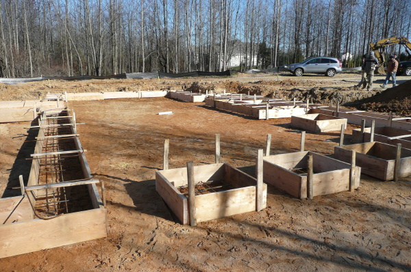
Foundation forms were set up this week and concrete should be placed on the following Monday. More photos in a slide show viewer after the link.
Plans for the two story version of this house design are available through our catalog page.
Continue reading "0751 RS House - foundation work"
Posted by
lavardera
at
12/12/2009 09:56:00 PM
0
comments
![]()
Wednesday, December 02, 2009
Plat House 3 officially launched
Our newest plan set, a three bedroom version of our popular Plat House design, is complete, Prints ready, catalog page posted, and flowing through the internet tubes.
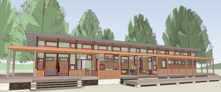
Without further delay we give you the link to the catalog page:
Continue reading "Plat House 3 officially launched"
Posted by
lavardera
at
12/02/2009 11:04:00 PM
4
comments
![]()
Tuesday, December 01, 2009
Three Bedroom Plat House coming to a Modern House Plan Catalog near you
Many people have asked for it, many have wished for it, almost everybody has suggested it. And today its here, the Plat House they have all been waiting for - one with three bedrooms.
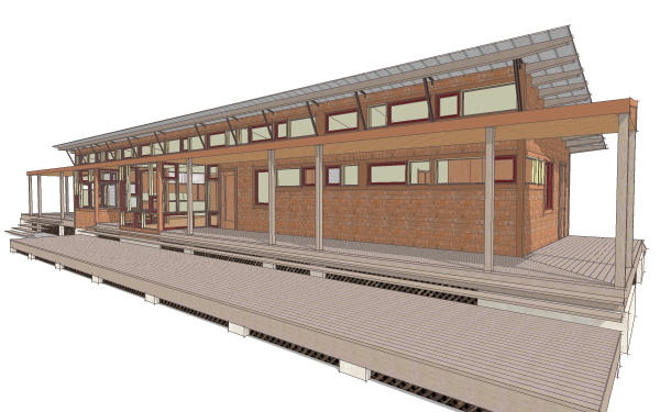
The three bedroom Plat House 3 still comes in at a svelte 1,650 sqft making it the smallest three bedroom house in our catalog. It gives up very little in its transition from a two bedroom cabin. From the outside it looks much the same, with the length extended on the bedroom side of the house. A third bedroom equal in size to the second bedroom completes the pair with the bathroom now between them. A catalog page is forthcoming which will show this all clearly. In the meantime the Construction Prints are already done and available. If you do wish to order before the catalog page is posted contact us.
Continue reading "Three Bedroom Plat House coming to a Modern House Plan Catalog near you"
Posted by
lavardera
at
12/01/2009 10:42:00 PM
1 comments
![]()
Wednesday, November 11, 2009
XHouse2 Construction Prints available starting Yesterday!
We are very happy to announce that the Construction Prints for the XHouse2 are complete, and available from the catalog page.
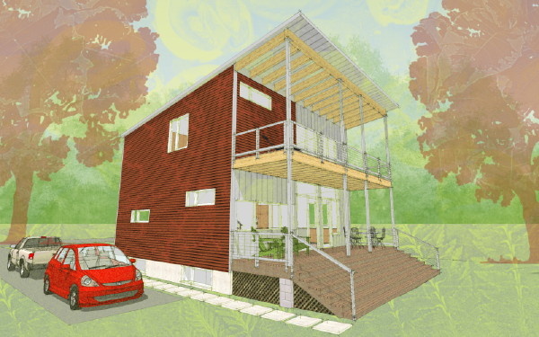
This is the first design from our summer '09 push to post new designs. It took a little longer than hoped to get the first Construction Print set posted, but that always seems to be the case. Next we are going to focus on the XHouse3, as we see its moderate size and compact footprint being appropriate for the times. Look for it in early 2010.
The XHouse2 at lamidesign.com/plans
Continue reading "XHouse2 Construction Prints available starting Yesterday!"
Posted by
lavardera
at
11/11/2009 02:19:00 PM
2
comments
![]()
Tuesday, November 03, 2009
XHouse Cladding Options
We've completed a drawing sheet showing a range of 3 cladding options for the XHouse series of designs. This will be included in each plan set for the XHouse collection.
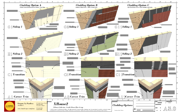
Our Construction Prints have always described a range of siding materials in the Owner's Choice portion of the Material List. The idea here is to show a range of siding options, from simple to more complex which would be specific to the designs. They also range in cost from less to more expensive, but our plans have always been about an open ended design that allowed the home owner to tailor the build to their budget and taste.
The first option is for painted cement siding panels a combination of board & batten and lapped siding patterns. This is the default siding pattern that is shown on our Original Collection designs. The XHouse designs also lend themselves to this cladding option as they typically include two different siding patterns on the walls. This is an accessible option as there is nothing tricky or unfamiliar about the installation, and most contractors will be completely familiar with this.
The second option is for a combination of laminate siding panels and through tinted cement siding panels. In this case the laminate siding panels are shown in a wood grain pattern. There are many siding panels available with this appearance, some with a resin impregnated wood surface, and others with a printed plastic laminate face - think formica for the walls of your house. The installation is shown for 24" high panels with metal flashed horizonal joints. This is not an inexpensive material but is quite handsome. The cement siding in this case is a through tinted material that requires no paint. The installation is a grid of panels with joints backed by metal flashing - no battens. This includes the addition of a drainage layer behind the siding for superior performance.This very siding scheme was featured on the 0751 RS House, and you can see it in those illustrations.
The third option is a combination of open wood rain screen cladding and standing seam metal panels. The rain screen is a recently popular look on many modern houses, and this is in fact the cladding scheme we have been featuring in the illustrations of the Xhouse Series designs. There are a range of woods that can be used for the siding planks, but the key component of this system is the vapor permeable water barrier that provides the final weather barrier for the wall system. The metal cladding is used on smaller portions of the XHouse designs, but is an important part of the overall look of the houses.
Just a little bit more work to complete on the XHouse2 Construction Print set. Look for the official intro before Thanksgiving.
Continue reading "XHouse Cladding Options"
Posted by
lavardera
at
11/03/2009 05:15:00 PM
0
comments
![]()
Tuesday, October 20, 2009
Videos of Ignite Philly talks published
And here is our talk courtesy of Ignite Philly and video hosting at Viddler.
Wow, that was fun, but I'm so glad I don't have to be in front of a camera speaking publicly all the time. Scratching modern house tv show off my to-do list now...
The rest of the evening's talks are here, and there were some great ones, everything from canning to public art, so check them out!
Continue reading "Videos of Ignite Philly talks published"
Posted by
lavardera
at
10/20/2009 04:34:00 PM
2
comments
![]()
Monday, October 19, 2009
More Ignite Philly photos via Flickr
Hand waving ensued

via flickr users relaxing and Rob Bender.
And a time lapse of the first half of the night - I am the third presenter:
by YouTube user claan1.
Continue reading "More Ignite Philly photos via Flickr"
Posted by
lavardera
at
10/19/2009 10:32:00 AM
2
comments
![]()
Wednesday, October 14, 2009
We went, We spoke, 300 listened
It actually happened, Greg spoke at Ignite Philly 4 on Tuesday night, 13 October. With 300 people in attendance it was probably the most eyes and minds ever thinking about modern house plans at the same moment!

The short format of the talks is a great challenge to force you to get to the essence of the idea you are presenting. We got a great reception from what was obviously a thoughtful crowd. What would you expect from a room full of people who came out on a Tuesday night to listen to people talk about ideas! The other speakers were just great and inspirational and the entire experience very uplifting. If you ever have an opportunity to present what you do at a venue like this by all means take advantage of it.
Videos of the event are to be forthcoming and we will post them when they surface. In the meantime there is a great review of the night on the Technically Philly Blog (photos above via Technically Philly). Thanks to the organizers for such a great venue and thank you to all that came to listen.
Continue reading "We went, We spoke, 300 listened"
Posted by
lavardera
at
10/14/2009 11:53:00 PM
0
comments
![]()
Tuesday, October 06, 2009
Presenting our case for House Plans at Ignite Philly
Next week we will be presenting our case for Modern House Plans at the Ignite Philly event in Philadelphia. This is one of those lightening formats - 20 slides, 15 seconds each, 5 minute talk.
We are working on the outline of the talk now, and so far we're about about 8 minutes so some serious trimming or faster talking has to go on. In the spirit of spreading the word I am going to post the draft of the outline below, and I welcome comments on what to chop out, or trim off!
• I am Greg La Vardera, an architect originally from Philadelphia, now in Merchantville NJ.
- Here to talk about my efforts to market modern house designs in the form of Catalog House Plans
- Catalog house plans are generally not very well regarded by practicing architects, primarily because level of design work in these mass produced designs are not very good.
• Where I am coming from - my prejudices:
- residential environment we are building in suburbia today is ugly, uninspired, and harmful to our society on many levels. Home design is so bad, and so widely understood to be bad that we actually have coined a term for the kind of homes built and sold today - we call them of course McMansions
- biggest players in the housing industry benefit from driving housing towards being a commodity, all of it alike, any one being a suitable alternative to the other. Appraisals, real estate sales, financing, all want every house to be like every other house. Builders & developers simply go along with whatever makes them the most money.
- Almost every other class of consumer product today is driven by design. Think about the way you pick a cell phone, or a car, your laptop. All of these products leverage design to deliver more value to you, or to simply convince you that they will. Now think about houses - they attempt to appeal to you with the most base level of pandering - phony architectural elements intended to convey status, multiple roof peaks, brick face, just on the front mind you.
• So how did I come to take up House Plans. Well, this was the state of things circa 2000, active practice, not really doing the kind of work I'm passionate about - I have a love of modern design, modern houses in particular. Modern houses are rare in the region, and clients wanting a modern house even rarer, if you are shopping for a house you can't go out and buy a modern house from a builder. Two choices - hire and architect and design and build one, or seek out an existing modern house from the 50s or 60s and hope a previous owner did not muck it up too badly.
- Into that context came Dwell Magazine - a home and garden magazine that claimed to be dedicated to modern design. I subscribed - my architects radar was telling me that they might actually deliver.
- And they did as well as anybody had tried before. I became active on their online messageboard - neanderthal of online social media. Much to my surprise I was meeting people there looking for well designed houses - not just a few, but hundreds of them, and the circulation of the magazine was climbing towards 300,000. The question was being asked where can I get a house like I see in the magazine. The answer unfortunately was - hire an architect, cost was a dead end for many of these folks. But there was demand, unknown till now, clearly unserved.
• The nature of the demand for housing - no data to back it up, guesstimate based on my experience.
- 90% of people don't care, don't think, or are simply ignorant of architecture as it might apply to the design of houses.
- 10% of people are intellectually curious enough to be anywhere from passionate, to interested, to simply open to the idea of design enriching their home.
- of that 10% maybe about 3% are able to afford an architect, or are passionate enough about design to be willing to spend what it takes to have an architect design their home.
- that leaves something in the neighborhood of 7% of people interested in design, enough to not be happy with a McMansion, but with no options almost universally resolve themselves to settling for a McMansion. But this is a huge country, and 7% of huge is huge. The maker of almost any consumer item would die to have 7% of their market. Apple computer? "Limped along for years with only 3-5% of personal computer sales, meanwhile cranking out some of the best designed product in their market.
• I wanted to reach these people. There was unrealized potential there, and they would expose others to better design, expose people who had never thought about the possibility of a house being something more. How to reach them at a cost people can afford and were willing to spend.
- Considered options, prefabrication was a new hot-button, but it required a change in the business model of builder, developer, and financing.
- Houseplans seemed like an interesting medium. Aside from the fact that architects generally hate them, they are widely used, and well understood by consumers and the housing industry.
- Its 2002 now I searched the world of house plans looking for what I considered good design. An epic search, about 30hrs of web browsing stretched over a week or so. I looked at thousands of house plans on dozens of web sites. I found a few small vendors of good quality traditional design styles, almost nothing in the modern style I was interested in. The overwhelming majority of designs were mediocre, bland, uninspired - just like the houses being built all across the country.
- I thought this could be a way to penetrate the market. Like gene therapy being delivered by a virus, I could use houseplans to deliver better design to the housing industry in a form they already understood and use every day.
• Defined our core values for how to approach this
- Committed to doing a better job than typical plan vendors to describe the house. Status quo plan sites show a floor plan and artist sketch of what the front looks like. Thats it. No views of the interiors, no view of the backs and sides of the house. We are committed to providing decent visualization of what a house will look like, all four sides, inside and out.
- Committed to assuming the consumer is competent, informed, intelligent, and interested in design, and try to meet them on that level.
- Committed to sharing my experiences and encouraging other architects to find new business models to influence the quality of housing, whether its by house plans, or prefabs, or even better something I've never thought of.
• Start up took time. I did not have thousands of plans to offer. I have to create product, at the same time run my practice. A couple of years to build modest selection - 3-4 designs
- Great reception to the effort. First ads flooded me inquiries, calls, constant emails. - But people do not build houses on impulse. The entire process of site search and approvals, borrowing, vetting builders means that there is a long lead time from discovering my product to being ready to buy.
- Lucky to have some early adopters that were on fast track and acquired plans.
- First houses were begun 2003, slowly, then more, by 2008 over a dozen houses built or underway that customers had sent back photos, and many others that plans went out to but did not stay in touch. (many resurface later - two so far in 09)
• I'm hopeful that this is just the start of the "infection". I would like to see a real epidemic emerge.
- So to aspiring homeowners out there I say do not settle for a McMansion. Put it to the housing industry to provide compelling product, product that meets your values and aspirations.
- To architects I say you have to be willing to get out of the cozy nook of your conventional practice and pursue new business models. You need to take risks, do things that actually make this tough business even tougher on you, in order to be able to influence the kind of housing that is built in the US. We need advocates of other design interests, not just modern, but green and craftsman, and bungalows - whatever design ideas you can gather passionate consumers around.
Continue reading "Presenting our case for House Plans at Ignite Philly"
Posted by
lavardera
at
10/06/2009 11:34:00 PM
0
comments
![]()
Monday, October 05, 2009
Financial Times covers modern house plans
London based financial newspaper Financial Times covered modern home plans this weekend in an article called Affordable Flair by Tracey Taylor that appeared in their House & Home section. Best part is the article featured our house plans and included quotes from myself, and one of our customers and photos of their Plat House.
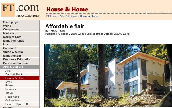
Its always nice to see modern house plans get coverage, and even better to see our customers proudly show their house and the hard work they've put into them. What made this really unique is that the Financial Times is a UK based publication. More or less they don't have house plans for sale in the UK. House plans are a uniquely American phenomenon. Houses elsewhere in the developed world are almost universally designed by architects. Its only here in the US that our frontier heritage and value of personal freedom has retained in most states the right for an individual to design their own house, and the strange distortion of that which is the right to have an unqualified person design your house. For better or worse its why house plans exist as an industry in the US, and also why the residential built environment is so poorly designed. As regular readers here know, our house plans are all about combatting the sorry state of the status quo by delivering good design to the market place using the very means responsible for its sorry state.
For any visitors from the UK who have came here via the Financial Times article, that is the short explanation of what this odd product house plans are about, and that's why an architect who might otherwise have other battles to fight might take this up as his cause.
For us locals you can see the Financial Times article here.
Continue reading "Financial Times covers modern house plans"
Posted by
lavardera
at
10/05/2009 12:13:00 PM
0
comments
![]()
Wednesday, September 09, 2009
0751 RS House - site cleared
The building site has been cleared and foundation work will begin this week if the predicted rain holds off.
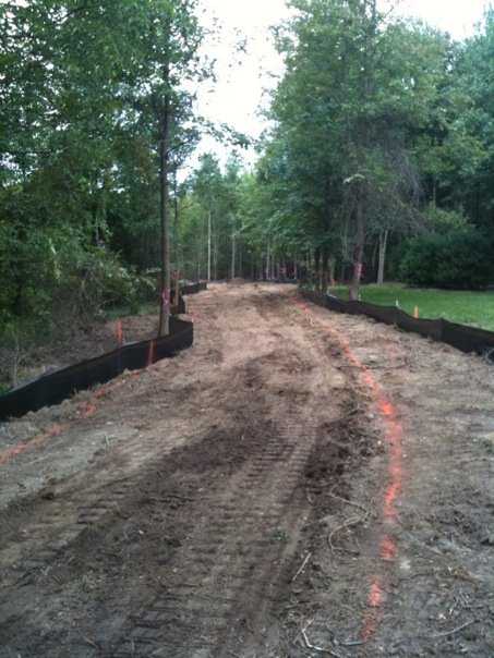
That is the view down the driveway. It extends through a wooded area that will screen the house from the road. An area along the drive must be cleared for the septic field, and finally the clearing for the house.
Remember plans for the two story version of this house design are available through our catalog page.
Continue reading "0751 RS House - site cleared"
Posted by
lavardera
at
9/09/2009 12:01:00 PM
6
comments
![]()
Friday, August 28, 2009
Modernism in Vermont
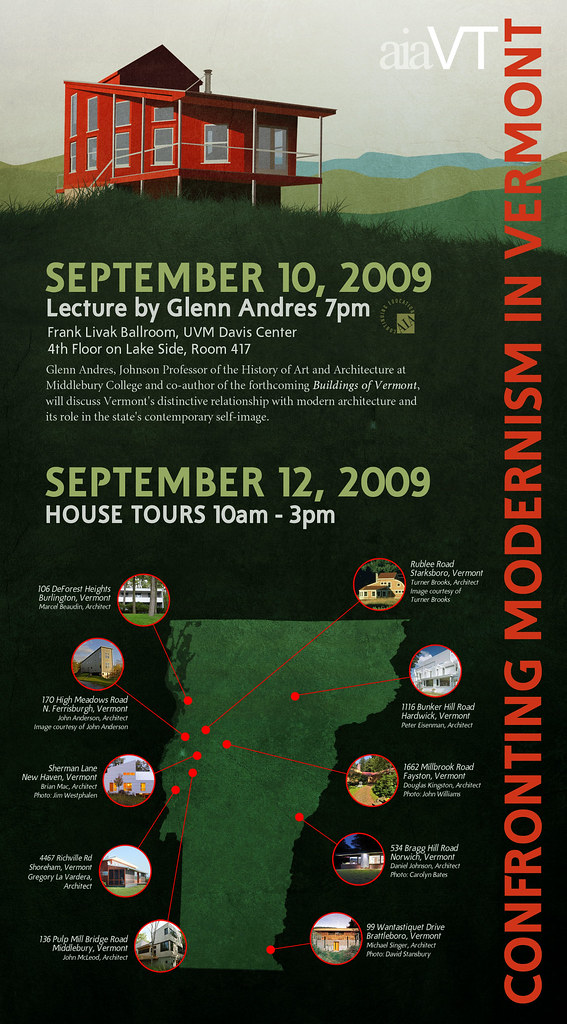
We are very pleased to announce the inclusion of the Vermont Plat House on a House Tour of Modern Vermont Houses.
The tour is part of a program organized the the Vermont Chapter of the American Institute of Architects, and includes a lecture on September 10th at Middlebury College, and the House Tours on September 12th which are literally all over the state. Its a fairly ambitious tour agenda as some of the houses are quite far apart! The bulk of the houses are nearby Middlebury College however, and its bound to be full of wonderful scenery and nice country drives.
We are very honored to be included on the tour which includes works by some well renowned architects such as Peter Eisenman and Turner Brooks, a long time favorite of mine. The full event poster is presented below. Clicking through will take you to our Flckr page where you can access larger copies if you wish.
Continue reading "Modernism in Vermont"
Posted by
lavardera
at
8/28/2009 12:06:00 PM
0
comments
![]()
Thursday, August 27, 2009
0751 Suburban House project - model revised
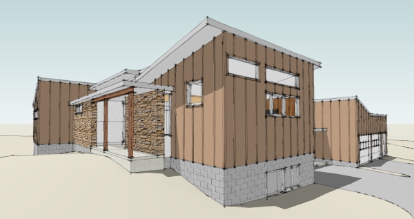
Revisions to the design model for this project are complete and now we can get a better idea of what the finished house will look like.

Site clearing will begin very soon and we should begin receiving construction photos. We plan on tracking this build here on the blog as it relates directly to the two story version which is available as a house plan via Open Source. See the link below.
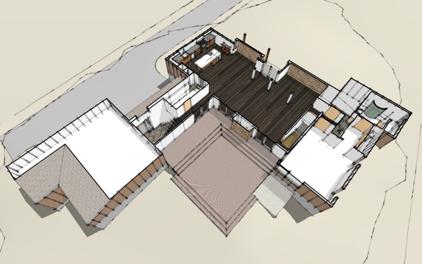
Continue reading "0751 Suburban House project - model revised"
Posted by
lavardera
at
8/27/2009 04:05:00 PM
0
comments
![]()
Saturday, August 22, 2009
0751 Suburban House project - building permit issued
We have not had any news about this project in many months - well the economy sort of crashed in the middle of the project!
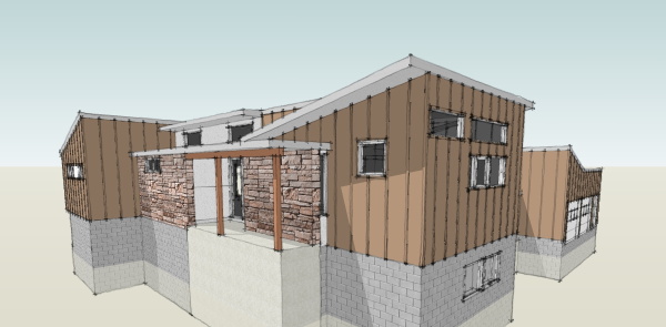
But the good news is that it is back on track, permits issued, and possibly even enjoying a bit of the competitive building climate out there. We will track the progress of this local modern house project on the blog. Remember that the plans for a two story version of this house are available through our catalog.
Continue reading "0751 Suburban House project - building permit issued"
Posted by
lavardera
at
8/22/2009 06:05:00 PM
4
comments
![]()
Monday, August 17, 2009
XHouse3 goes live in the catalog
Design Prints are available immediately from the XHouse3 catalog page.
This also brings to an end our summer push for new designs. We'll now be retiring to the "laboratory" to produce the Construction Prints for these new designs. Construction Prints usually take a little bit longer so don't expect the introduction pace to be as rapid as it has been this summer. But we are committed to rolling out these designs and having them available as the economy returns to building houses.
So lets review what has been introduced recently. At the beginning of May we introduced the XHouse1 and the entire concept of the new XHouse collection. Following on that in June we rolled out the XHouse2 design, built upon the previous design of our 3030 EcoSteel House. Then in July we took a break from the house plan work to consolidate the designs work we have done for shipping container based homes, and we introduced the ibu_revolution system for building with ISO shipping containers. With that done we returned to the XHouse collection to document the XHouse3, introduced today. Not too shabby for a couple of months in the summer. Stay tuned for more great things.
Continue reading "XHouse3 goes live in the catalog"
Posted by
lavardera
at
8/17/2009 03:02:00 PM
5
comments
![]()
Saturday, August 15, 2009
and another - XHouse3
Posted by
lavardera
at
8/15/2009 05:17:00 PM
6
comments
![]()
Wednesday, August 12, 2009
peak at the coming renderings - XHouse3
No surprises here, the images will share the mood and material palette of the other XHouse designs.
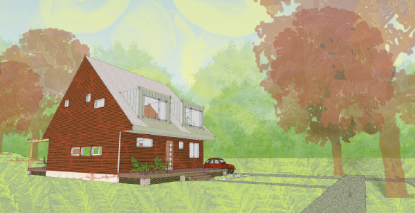
Here is the XHouse3, the first MoTrad (modern+traditional form) House in our collection. The renderings are moving along quickly and we should have the design posted to the catalog and Design Prints available very soon.
Continue reading "peak at the coming renderings - XHouse3"
Posted by
lavardera
at
8/12/2009 05:58:00 PM
2
comments
![]()
Sunday, August 02, 2009
modeling of house complete - XHouse3
The primary modeling of the house is done, and now we'll move on to placing it on the site model, adding props and exporting images to render.
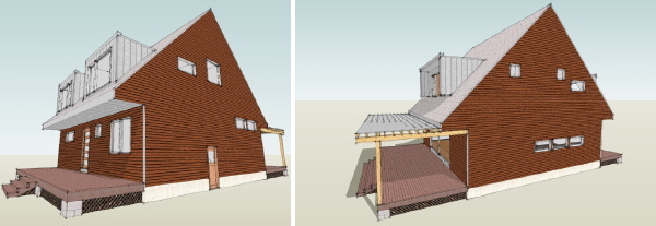
Now you can get a good sense of how the house will look, and see a few images of the main living spaces inside as well. This house will be in our Stealth House group as it will fit well into existing and new traditionally planned neighborhoods with narrow and deep lots. With the size just under 2000 sqft for a 3 bedroom home with a home office I think its going to have wide appeal.

The front and rear porches allow you to extend your living outside, and the rear porch can be screened if thats needed to keep out mosquitos in your area. Keep watching - we should have the Design Prints up in the catalog within two weeks.
Continue reading "modeling of house complete - XHouse3"
Posted by
lavardera
at
8/02/2009 03:15:00 PM
2
comments
![]()
Thursday, July 30, 2009
we have windows - XHouse3
The model now has window and door units which lends a little bit more scale to the image.
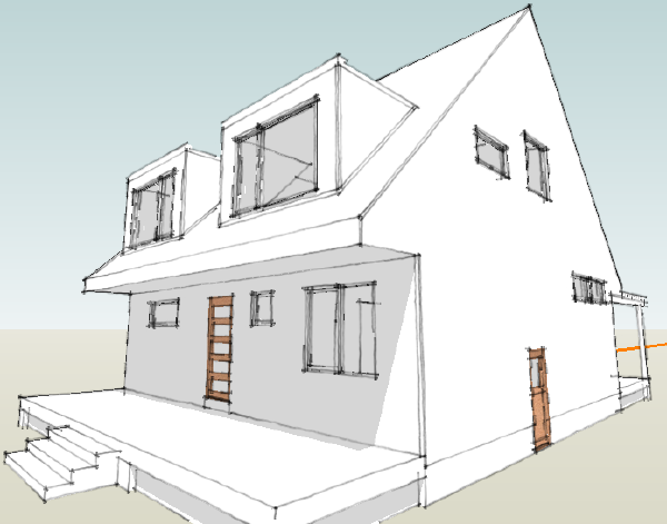
Next will be the fit out of interior doors, cabinets, etc. Coming along - final stretch of modeling.
Continue reading "we have windows - XHouse3"
Posted by
lavardera
at
7/30/2009 05:15:00 PM
0
comments
![]()
Tuesday, July 28, 2009
the form is revealed - XHouse3
Now you can see the outside shape of the house. Based on the massing of traditional forms, yet it will be thoroughly modern.
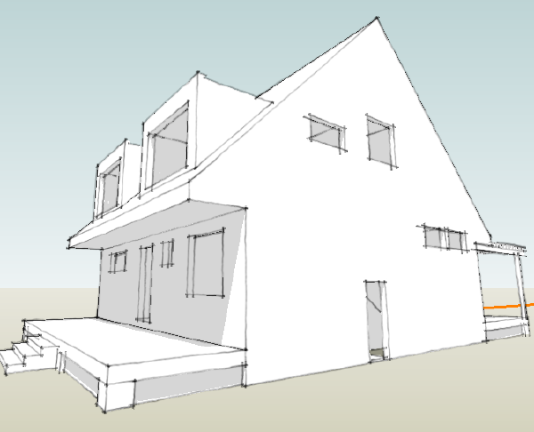
I've been studying houses with this particular combination of modern detail + space with traditional massing and form. I've been calling them "Motrad", at least to myself, but I like the term.
This design will offer 3 bedrooms and a small home office, 2 1/2 baths, all within a tidy 2000 sqft. A front and rear porch can slightly expand the small 32ft square footprint of the home.
Continue reading "the form is revealed - XHouse3"
Posted by
lavardera
at
7/28/2009 12:29:00 AM
0
comments
![]()
Monday, July 27, 2009
insides - XHouse3
This is the insides of the house, but its the outside of the insides.
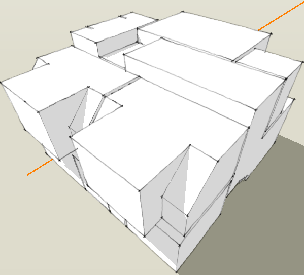
Did you follow that?
Continue reading "insides - XHouse3"
Posted by
lavardera
at
7/27/2009 12:42:00 PM
0
comments
![]()
Friday, July 24, 2009
New design begins - XHouse3
The XHouse collection gets its third design.
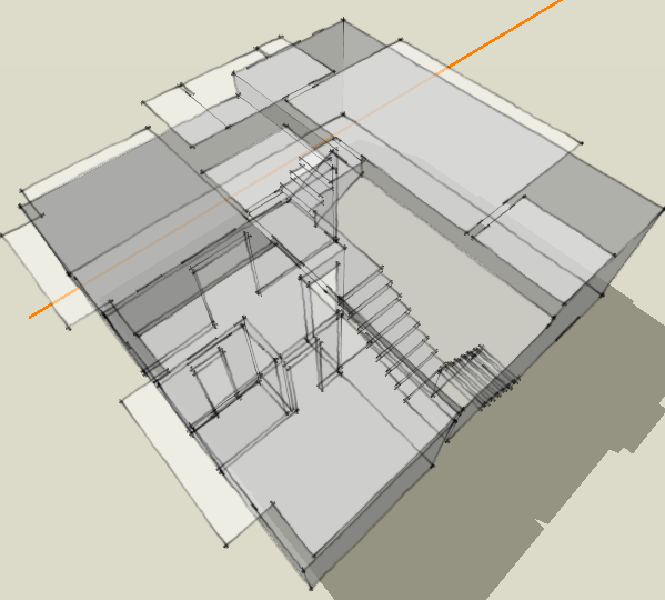
This new design was started this week, and today we are blocking it out in 3d in preparation for creating Design Prints. We'll describe it in more detail in coming posts.
Continue reading "New design begins - XHouse3"
Posted by
lavardera
at
7/24/2009 03:45:00 PM
2
comments
![]()
Wednesday, July 22, 2009
Formally introducing: ibu-revolution
The way to build dwellings with shipping containers
Yes, today is the day we launch the new portion of our site dedicated to showing our long promised system for building dwellings from shipping containers. Its been a long multi-year journey, much of it documented right here on the blog. Its worthwhile now going back and reviewing where this began. I think my path to this point is informative, and most importantly speaks to how carefully considered this system is. We invite you to click through to read the rest of the history of this journey. But first may we present ibu_revolution.
visit ibu_revolution for more information
Like much else around here my first interest in the application of shipping containers to building shelter began on the original Dwell message-boards. Prefab was heating up thanks to Dwell magazines competition to design a prefab house, and notably one of the entries by architect Wes Jones featured containers, something he had been advocating for some time. A new site fabprefab.com was launched to track all this activity. Fabprefab included a section on shipping container homes which began the path to legitimizing it as a building technique.
Fabprefab included a message-board where there was much discussion about just how you would go about building a home out of these things. When one day in the Fall of 2004, lo and behold, a fellow David Cross appears on the message boards and says Wow, its really great that you are all so interested in building a house with containers, and oh by the way here are some pictures of the container house that we are right in the middle of building in Charleston. Well we were all floored.
David and I spoke a lot over the next few months and I tried to absorb as much as I could from him. He was an ex-merchant marine who had been working with inter-modal shipping containers for many years. His company was folded into a larger outfit who among other things were creating custom modified command centers and field offices from containers. David was interested in expanding it into housing and the Charleston house was their first proof of concept. I made plans to go visit their factory and see what it was all about.
Around this time David and I had a discussion about the difficulties in convincing building officials of the merits of building with containers. David advanced the idea that a "shipping container" as a term was too loaded with preconceptions. He proposed that this was a form of modular construction using Inter-modal Steel Building Units, or ISBUs, or IBUs as I call them. We were not building with shipping containers. We were building with ISBUs. That was it - the term was coined by David, I wrote about it in the blog in March 05. Since then the term ISBU has take firm hold of the concept and you can see it being used all over the internet. Just Google it - here, let me get that for you. Thats right. 2005 - First time ISBU on the internet - right here where you are reading now. Fast forward to Today - ISBU in use everywhere, including by every greazy dealer that would like to convince you they know what this is all about. Thats how you can tell its sunk in!
So I went down to Tampa and visited the factory, got a full tour of the anatomy of an ISO box, I saw a mysterious command center being fabbed, and had my fingers protected from white hot metal by a mysterious insulation. I came away with the seeds planted. I had an understanding of how the boxes were built, what was good about them, what was their weaknesses, and I had begun to formulate my ideas about what was the best way to use them to make houses. A sketch that was posted along with my IBU essay in 2004 shows the first iteration of the house design you will be seeing today. Three 20ft boxes gathered around to form a large open space. This space to serve as the common areas of the typical home program, and the containers to form the other functions that can tolerate their limited dimensions. Shortly after this I posted a cartoon about a container home being built in a traditional neighborhood. In this cartoon I used one of my design sketches of a two story house based on modular units at the perimeter and a resultant space between them roofed with a pre-engineered building system.
My first design study was to create a small dwelling within a single 40ft unit. I saw as a small cabin, and as an IBU from which larger multi unit dwellings could be built. In 2005 I created the schematic model, and later that year designed two sketch proposals for a multi-unit in-fill building for a site in Los Angeles. They had a revision of their zoning code to promote multi family densities in existing neighborhoods in order to create more housing in the city. One of the schemes used the single 40ft module design. The other used a stack of two module layouts that followed the units on the perimeter+large space in the center model, again with a pre-engineered roof system.
There was a little bit of a lull in my activity in 06 but during this time David Cross helped found and joined a new company whose sole mission was to build with shipping containers - SG Blocks. Here they pulled together all of the experts who had worked on their projects to date, now ready to advance the practice.
I did not advance the concept again until the end of 2006 when I was approached by a friend Jeff Rous to enter a competition for student housing. It seemed like a perfect application for IBUs and we came in a respectable second place. In the course of preparing the competition entry I was able to work through much of the concept for how the single module units would combine into larger multi unit buildings. At the root the single module multi unit buildings come together in the same way as the multi module dwellings. In the case of of an apartment building the occupants have shared common space between their units, just as in a multi module home the family would have shared living space between the modules. I worked my way through much of the concept work including various accessory pieces that would join to the IBUs to add functions.
The competition was completed in the winter of 2007 and following it I continued to work on the logic of the system. That summer I presented a brief outline of how the system would work in total. The first part was the spacial problem as I've described above - making positive quality space for a dwelling. The second part was a discipline for modifying the containers into modular units. I'd envisioned limiting the set of alterations that had to be made to a small set of door and window openings. This would reduce the amount of engineering required and make the manufacturing more routine. Next I needed to use the opening designs to create again a limited set of container modifications that supported several different interior fit-outs. In this way a limited stock of modified boxes could be used to create a range of floor plan solutions. An outline of this very system was presented on the blog in July of 07 two years ago. The sample floor plan published harkens directly back to the first sketch posted with my ISBU essay from 2005.
Forward a year to 2008 I was engaged by artist John Unger to design a home and studio using shipping containers. John brought a competent concept to the table which while not congruent with my system shared enough characteristics to serve as a test bed and a platform for working through numerous details. Together we discovered many solutions such as utilizing industrial mezzanine structures, and hanger lift doors, and some things such as the corrugated steel arch roof which have been incorporated as options for the system. Currently it appears the multi story scheme will morph into a single story scheme and in that process I'm sure we will discover more applicable to the system. Its been a very useful process and as near to prototyping the system as I could hope.
Which brings us to the present. I've finally had the opportunity to model and briefly document the expansive possibilities that this system brings to building with IBUs. I've extensively documented the range of variations for a simple house design. More designs remain to be elaborated, but this sample reveals the great range of more to come.
Continue reading "Formally introducing: ibu-revolution"
Posted by
lavardera
at
7/22/2009 12:58:00 AM
9
comments
![]()
Wednesday, July 08, 2009
Another Plat House surfaces in Texas
Once again a house built by one of our customers resurfaces after it is done - a surprise Plat House!
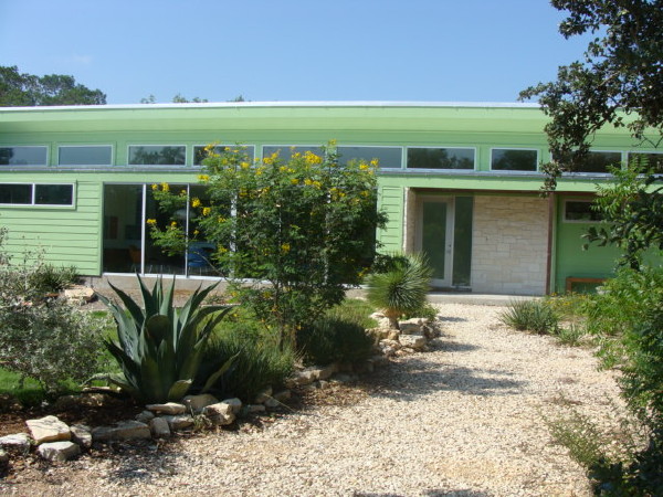
This Plat House was built outside of Austin, Texas - and yes, that makes three Plat Houses in the Austin area and the surrounding hill country. The owner made extensive changes to the stock design, some which you can see in the photos. There is a large window wall in the main living space and the recess between the kitchen and living room has been closed in. They have used a stone facing on large portions of the walls, and the places with lap siding are a painted a terrific almost tropical green. The side overhangs are also modified, having a bit of a ranch country feel to them. All in all a fantastic Plat House. Click through to see a photo browser with more pictures.
Continue reading "Another Plat House surfaces in Texas"
Posted by
lavardera
at
7/08/2009 09:32:00 PM
0
comments
![]()
Thursday, July 02, 2009
ibu_revolution - the system has a name
Yup, we gave the system a name. LamiDesign IBU Building System, while perhaps more descriptive and accurate, really says much less about what this is really all about.
If you did not notice the blog is sporting a new ibu_revolution tag, and we have also begun a twitter feed for ibu_revolution. You can find that here: https://twitter.com/ibu_revolution Much of what gets posted there will get the RT treatment and show up in the lamidesign twitter feed, and the mini-blog you'll find in this blogs right side bar. But if you want the news first hand direct, then follow up ibu_revolution on twitter and you'll get the scoop.
Continue reading "ibu_revolution - the system has a name"
Posted by
lavardera
at
7/02/2009 11:55:00 PM
0
comments
![]()
Wednesday, July 01, 2009
LamiDesign IBU Building System - working on a longer animation
I'm putting together a longer animation that I hope will explain the exponential potential of the system proposal. All this video and iMovie stuff is new to me so bear with me while I work on it!
Right now I'm shooting to do it in Hi Def 720p since it really does not appear to be any harder than doing it in old school formats. Files are just bigger and eat up more hard drive...!
Continue reading "LamiDesign IBU Building System - working on a longer animation"
Posted by
lavardera
at
7/01/2009 03:03:00 PM
0
comments
![]()
Monday, June 29, 2009
LamiDesign IBU Building System - not a house, a platform
Its not a house design - its a platform for making house designs.
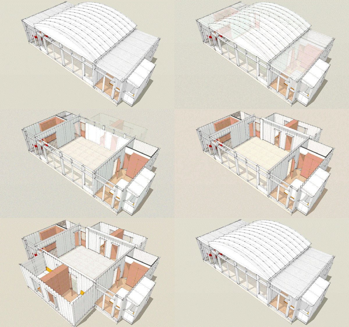
Does that make sense to you? We are designing houses here, yes, but more so, we are designing a way to make houses. If done right it becomes something that anybody can run with, something that spawns results that we will never imagine.
With a limited number of predesigned modules you can create floor plan variations at a factor of 3-4 for a given house design - or Schema as we are calling them. Working with a dozen module types we can easily create 40 or more different houses, some with subtle differences, some with great differences. And that is without resorting to simple variations such as mirrored floor plans. The dozen modules designs are based on slightly smaller set of 9 modified container boxes. Different fit-outs are possible within the modifications made to a given box which can yield multiple modules designs for a single set of box modifications. Owners can choose to create their own module fit-out within one of our standard modules expanding the range of possibilities.
Central to this is that we only need a limited number of physical modifications to the boxes to create the modules. They can be pre-engineered, calculations packaged and ready for permit applications simplifying the typically uncertain road for permitting this unusual construction. It reduces the set of modules to a manageable set of stock boxes, so much so that a vendor could even keep inventory. So now some improvement can be made over the every house custom merry-go-round, and one-off boxes and design work that goes along with it. Yet you are not locked into a limited number of house designs. Its a system designed for production.
Ok, raise your hand if this is starting to sink in.
Continue reading "LamiDesign IBU Building System - not a house, a platform"
Posted by
lavardera
at
6/29/2009 12:50:00 PM
11
comments
![]()
Friday, June 26, 2009
LamiDesign IBU Building System - a two bedroom module
A two bedroom module - a master bedroom with a pop-out and a secondary bedroom.
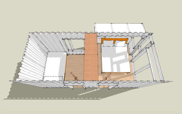
I know that is the smallest master bedroom you've ever seen - barely room to walk around a bed. Here is the thing - this can always be used with another larger master bedroom module just to make one of the other bedrooms larger. Maybe you are making a vacation house and having room for guests, or in-laws, or grown children is the priority. Maybe small bedrooms to sleep guests and larger living areas are the priority. Or maybe you just realize that you do little more than sleep in that room so why put any more space there than necessary.
With our rational system of predesigned modules its up to you - you can combine units to make the kind of accomodations you need, whether its a full time residence or a weekend house with room for guests and fun. There are lots of people proposing and/or building container houses out there in the big wide internet. None use the inherent modularity of containers this way. Nobody gets it the way we do. This modular system is why it makes sense to build with these - to leverage them to empower you to make the house you want, the house that fits your life.
This is Module-bedroom-2-variation 1, or Mb2.1
Continue reading "LamiDesign IBU Building System - a two bedroom module"
Posted by
lavardera
at
6/26/2009 04:09:00 PM
0
comments
![]()
Thursday, June 25, 2009
LamiDesign IBU Building System - a bedroom looks like this
This time a master bedroom is depicted.
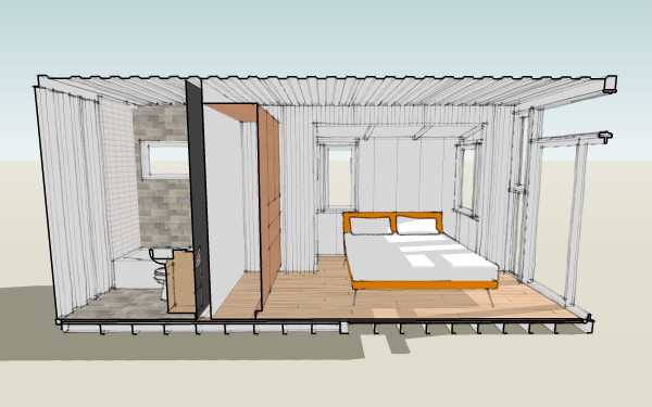
No, the bedroom is not big - these are not going to be giant houses. The idea is to make a small home, an efficient home, and make it livable, comfortable, and enjoyable. A house does not have to be big to do any of those things. This is Module-master bedroom-1-variation 1, or Mmb1.1
Continue reading "LamiDesign IBU Building System - a bedroom looks like this"
Posted by
lavardera
at
6/25/2009 06:14:00 PM
2
comments
![]()
LamiDesign IBU Building System - mocking up modules
Its time. I'm mocking up the modular units shown in our past design studies.
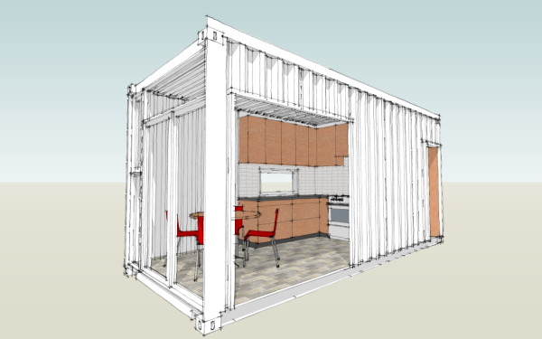
Yes - its been two years since we've been able to work on this. We may be slow, but we are persistent. This is Module-kitchen-1-variation 2, or Mk1.2
Continue reading "LamiDesign IBU Building System - mocking up modules"
Posted by
lavardera
at
6/25/2009 11:38:00 AM
0
comments
![]()
Wednesday, June 17, 2009
3030 House - new interior images
Some updated interior photos of the EcoSteel Cabin John 3030 House
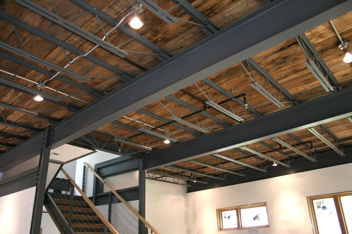
A more detailed description of the progress can be seen on the owner's blog. Link, and a photo browser after the jump.
Continue reading "3030 House - new interior images"
Posted by
lavardera
at
6/17/2009 12:28:00 AM
11
comments
![]()
Sunday, June 14, 2009
getting the show on the road - XHouse2
The XHouse2 is posted to the online catalog, and Design Prints are avaialble immediately. Construction Prints will be coming in the near future.

The XHouse2 at lamidesign.com/plans
Continue reading "getting the show on the road - XHouse2"
Posted by
lavardera
at
6/14/2009 04:18:00 PM
0
comments
![]()
Wednesday, June 10, 2009
inside the XHouse2
Fist image of interior view for the new XHouse2 design.
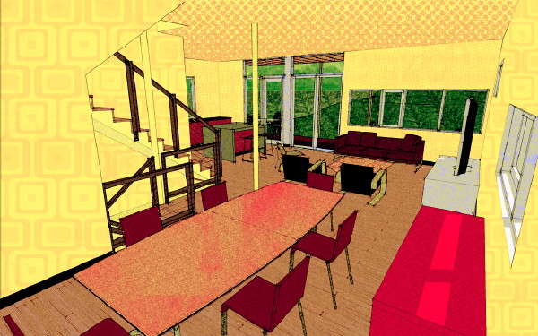
A similar treatment to the XHouse1 drawings, but rather than the organic textures I am using on the exterior views this time I am focusing on some funky retro patterns for the wall and ceiling.
Continue reading "inside the XHouse2"
Posted by
lavardera
at
6/10/2009 05:35:00 PM
0
comments
![]()
Monday, June 08, 2009
Design Prints begun - XHouse2
Working through the exterior images now.
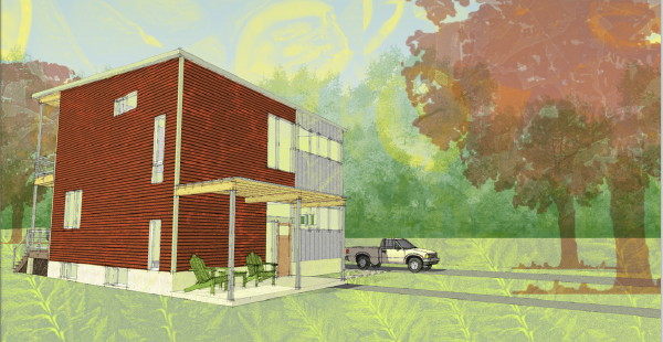
Yes, it is a similar look and feel to the XHouse1. At least the first couple of houses in the XHouse collection will have this look for the renderings, although the houses will vary. Later when I have a breather I can experiment with the rendering tools more and branch out. Right now I have to get better with the interiors. I was not satisfied with those on the XHouse1 and hope to do better this time.
Continue reading "Design Prints begun - XHouse2"
Posted by
lavardera
at
6/08/2009 12:03:00 PM
0
comments
![]()
Saturday, June 06, 2009
Plat House on Dwell Magazine's web site
Back in 2006 Dwell Magazine published an article about our customer who built a Plat House in Arkansas. The article is now also on Dwells new and expanding web site.
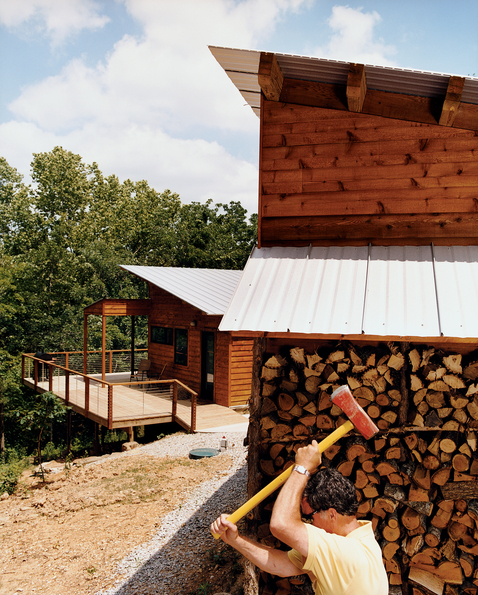
The article which appeared in the October 2006 issue of Dwell was titled "Part of the Plan" and was written by Eric Lawlor. He recounts the history of how the owner's came to build the house and some of the trials of being your own contractor. If you never saw the article, if it happened before you found our site, or before you were interested in our houses, then you can jump over to their site and read the article now:
Arkansas Plat House on Dwell Magazine's web site
Photo above is from the Dwell web site and also appeared in the article is by Daniel Hennessy. There are a few more photos on Dwell's site in a slideshow - don't miss them.
Continue reading "Plat House on Dwell Magazine's web site"
Posted by
lavardera
at
6/06/2009 06:15:00 PM
2
comments
![]()
Thursday, June 04, 2009
In the ground - XHouse2
Its time to do that painting thing over the 3d image exports.
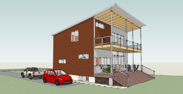
I have to see if I can recreate the same look I used on the XHouse1. Same look, smaller size. I've downsized the rendering's automobile aspirations too. No Audi this time. Its a Honda Fit, and a Chevy pickup in honor of GM's bankruptcy.
Continue reading "In the ground - XHouse2"
Posted by
lavardera
at
6/04/2009 05:42:00 PM
6
comments
![]()
Tuesday, June 02, 2009
Massachusetts EcoSteel Plat House update
Today we received a few new photos of the Massachusetts Plat House project from EcoSteel. It is far along from the last update we got and its amazing to see it all closed in with windows, looking very much like the Plat House.
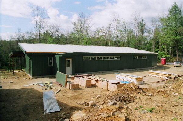
Please click through to see a few more photos in a photo browser.
Continue reading "Massachusetts EcoSteel Plat House update"
Posted by
lavardera
at
6/02/2009 10:04:00 PM
4
comments
![]()
Monday, June 01, 2009
House model complete - XHouse2
I've finished the house model, and now its time to work on fitting it into a site model.
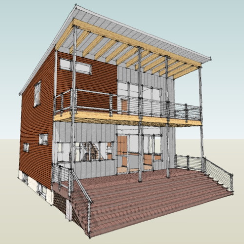
Posted by
lavardera
at
6/01/2009 10:53:00 PM
0
comments
![]()
Friday, May 29, 2009
A section view - XHouse2
A cut through the stair at the center of the house shows how the levels are connected.
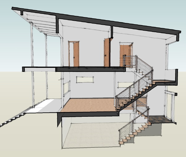
I think having spaces that you use day to day at the stair landing level makes the house feel larger, and also makes the floors feel more connected.
Continue reading "A section view - XHouse2"
Posted by
lavardera
at
5/29/2009 11:57:00 PM
0
comments
![]()

