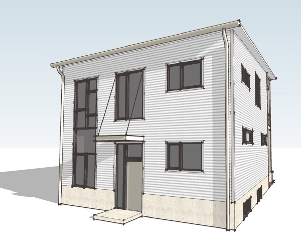
window locations - XHouse1
I mentioned this week on the Twitter feed that I was working on the window locations for this new house design. Without an actual site putting pressures on the house from the outside, or an owner's desire for furnishing of the inside to work from the only thing leading the window placement is composition. The windows in question are for the rear corner of the house where the master bathroom resides above the home office/studio space.
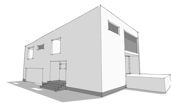
This is an image from the very early sketch model shown on the earliest posting of this design. At this point I had not located any windows for the studio, and had anticipated one high horizontal window in the master bathroom. As the planning of the interior progressed we ended up with the sinks on the rear wall where the high window was shown. I would rather not place a window above the sinks and mirror so that became a strike against this high window. Also I was coming to the conclusion that the massing of the house should reflect the large open space of the living/dining/kitchen that runs front to back, and the more cellular division of the bedrooms, bathrooms and smaller spaces. I think that the two end facades consisting of a contrast of big windows and solid walls worked to reinforce that. But that would mean that the high window in the bathroom worked against this. Strike two for the original bathroom window. Continues after the link below.
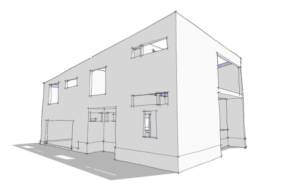
Now this is where it is right now. The master bedroom window wants to be on the side of the house, and it spans over the tub and into the toilet room. Now below in the home office/studio there are two things going on. Number one the space is tall, a story and half because it is under the master bedroom, the highest level of the house. To emphasize the height I really wanted to have a window high on the wall of this room. I also want a window in this room down at eye height, and I want it to conform to the code requirements for a sleeping room so that this can be used as a guest room if desired. In the sketch above I've taken a first shot at placing these windows, the high one corresponding to the master bathroom above and a smaller one below. My problem is that I don't think these are keeping with the DOT-DASH-DOT rhythm of the other windows on this side of the house. The horizontal window at the master bedroom I think is fine, but the two in the studio are making too much "noise".
So there are a few options. I can replace the two windows with a single larger window similar to the two upstairs bedrooms. This will forgo the high window for this space. Or alternatively I can move the high window for the studio around the corner to the back wall to get it off the side facade, but this will violate the solid/void relationship of the end walls that I want to maintain, similar to the earlier sketch. That's what I'm working with right now.
Continue reading "window locations - XHouse1"
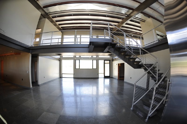
 I have to confess that I find the space really interesting, but no doubt it won't be for everybody.
 The Hus1 is also the first design of our new collection, called the Blueprints Collection which will focus on mid-century inspired home designs. You can read a little bit more about the new collection on the
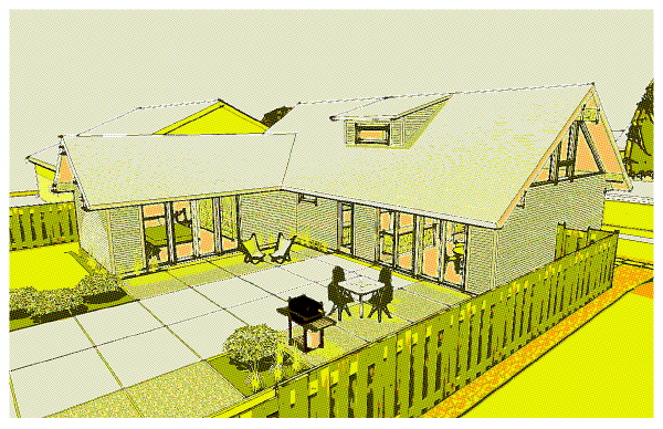
 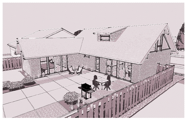 which is a halftone filter run over a black and white image of the model. More variations below the fold.
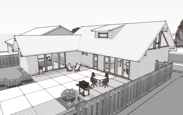 maybe sunset yellow?
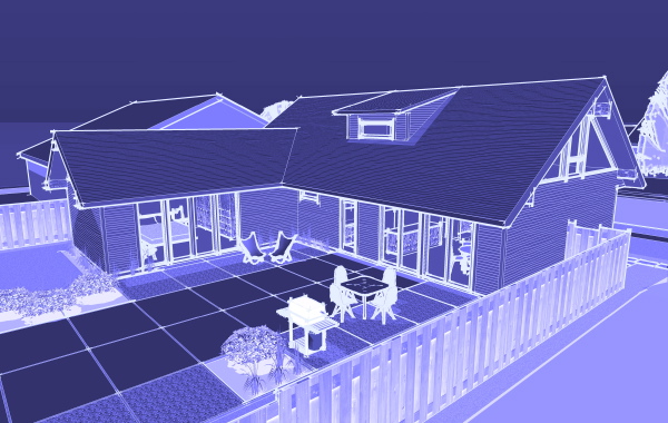
 or working with an image that approximates an old blueprint
 Just a quick update with new photos in a browser after the link below.
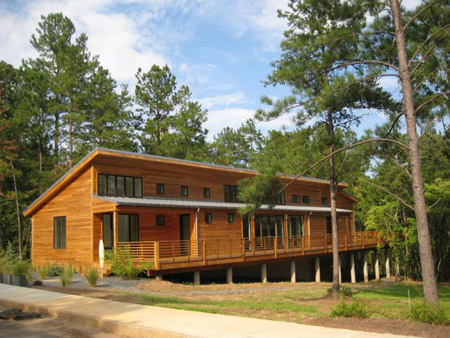 The house has been significantly modified for its site. The window arrangement has been altered and the floor plans also appears to have been changed, with the bay areas joined and some additional space added to the master bedroom.
The clerestory windows have been changed from a uniform window band into smaller windows at private spaces and larger windows at common areas of the house. The views from the living/dining/kitchen area show how nice this has turned out. They have a very cool italian kitchen, and some very nice light fixtures in the room which really looks like it has turned out well. Click through for more photos in a photo browser.
The house has been significantly modified for its site. The window arrangement has been altered and the floor plans also appears to have been changed, with the bay areas joined and some additional space added to the master bedroom.
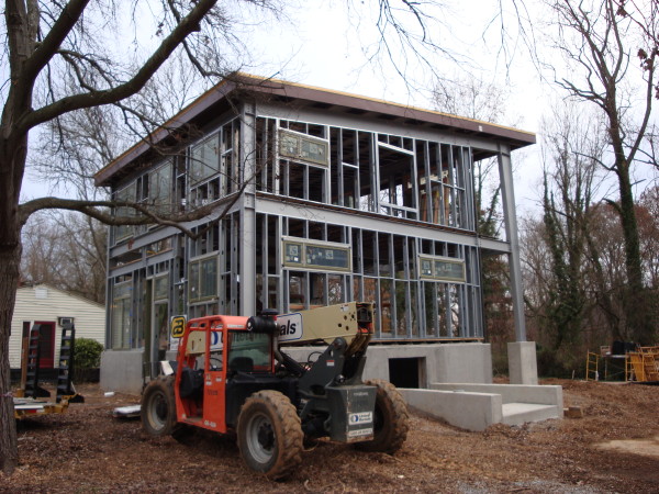
The clerestory windows have been changed from a uniform window band into smaller windows at private spaces and larger windows at common areas of the house. The views from the living/dining/kitchen area show how nice this has turned out. They have a very cool italian kitchen, and some very nice light fixtures in the room which really looks like it has turned out well. Click through for more photos in a photo browser.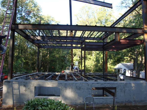 Here we see the frame set up to the second floor, and first and second floor joists in place. The roof framing has just begun.
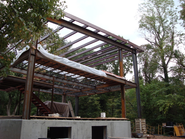 Here it appears the entire main framing system is in place, including the roof purlins. Next will be the light gage wall framing to infill the exterior walls and frame out the window and door openings.
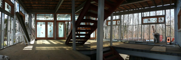
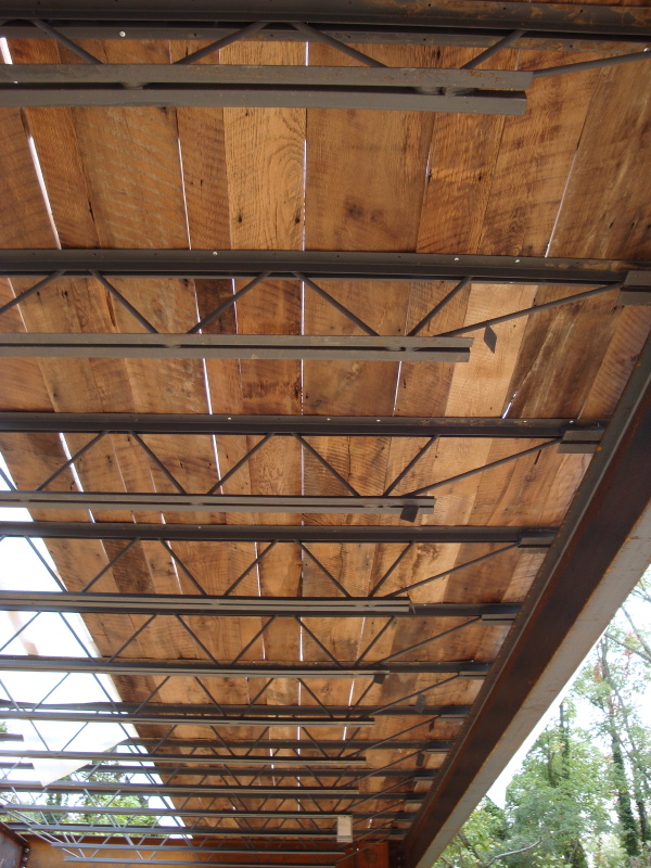 Here we see the recycled barn siding that we saw in an earlier post being installed as the first floor ceiling. The bar joists will be exposed, painted, but more or less as we see them here. The barn planks are going directly over the joists, and plywood floor deck will go down over the planks, and then finish flooring. I love the way this looks. The contrast between the industrial truss joists and the rustic planks is just great.
Tune into the
Here we see the recycled barn siding that we saw in an earlier post being installed as the first floor ceiling. The bar joists will be exposed, painted, but more or less as we see them here. The barn planks are going directly over the joists, and plywood floor deck will go down over the planks, and then finish flooring. I love the way this looks. The contrast between the industrial truss joists and the rustic planks is just great.
Tune into the 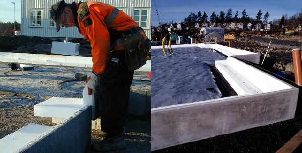
 More of the photos in a photo browser after the click-through.
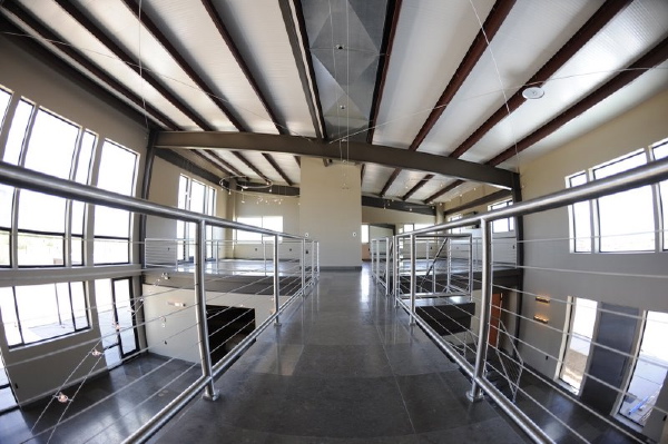 So this is it. Perhaps we will see some photos of the place with furniture, but this project is coming to a close. Its been very exciting to see it come together, and the owner has been very generous with their photos. Our thanks to them for sharing their house with us, and you our readers.
 Unplggd has a series where they show the workplace of a blogger that they like or follow. We are very pleased that they follow our blog workalcious and asked us to share our workplace with their readers.
The workalicious blog is about, you guessed it, the workplace! We write about office design, office furniture, accessories, about office culture, and we also like to share examples of interesting workplaces.
So check out our office:
Unplggd has a series where they show the workplace of a blogger that they like or follow. We are very pleased that they follow our blog workalcious and asked us to share our workplace with their readers.
The workalicious blog is about, you guessed it, the workplace! We write about office design, office furniture, accessories, about office culture, and we also like to share examples of interesting workplaces.
So check out our office:
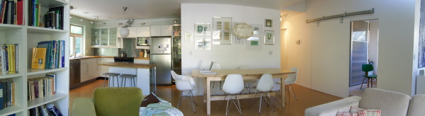 A panoramic view of the Sage home interior.
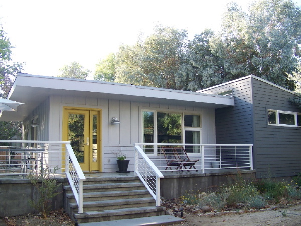 Sara and David's big goal for this house was to bring it in for $100 a square foot, no small task in the expensive Los Angeles county construction market. But they had a plan, to do copious research on their own, to get the most value out of every consultant they used, and every vendor and contractor they engaged, they resolved to build the house modular, to source their modules from a market with much lower labor cost in Utah, and to complete a good deal of the work themselves as sweat equity. It was their dream to have a modern house and I must say they succeeded on every count. From finding the best materials and vendors, to researching planting material and submitting their own landscape plan for permitting, Sara and David did it all and tracked it in detail in their blog on LiveModern.com. It was a tremendous inspiration and people cheered for them every step of the way. Its hard to know how many other people they inspired to dig their heels in and pursue their own dream of a modern house.
 When the work was done, well, almost done, and the smoke had cleared I believe Sara calculated that their cost worked out to about 114$/sqft. This was pretty remarkable at a time when there were literally dozens of prefab house start-ups trying to get traction. The lament was how everything was costing much more than expected, and much more than hoped. In that milieu of dashed hopes Sara and David fought and struggled to make their house happen at a cost that was a pipe dream for the rest of the market.
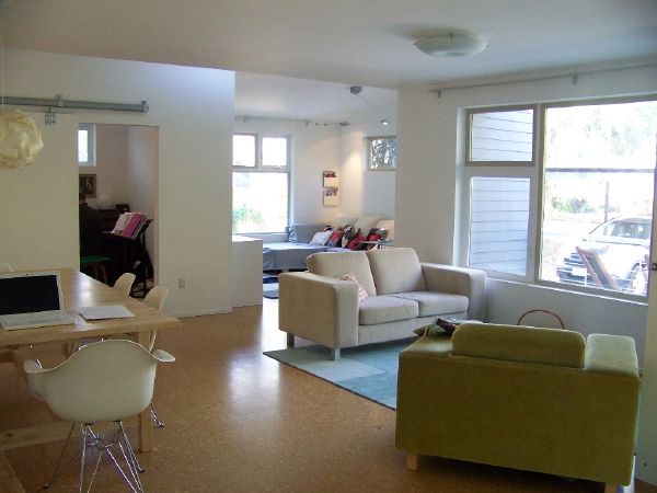
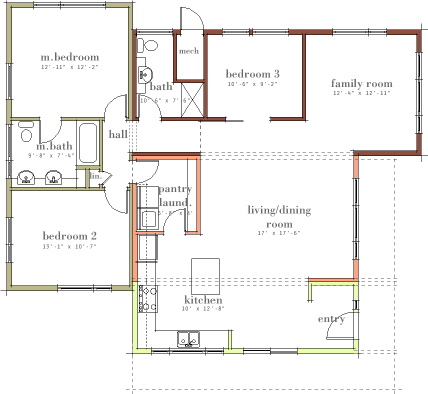 The house is a reasonable 1400 sqft, 3 bedrooms, with an open kitchen, living/dining, family room space, it really is a wonderful plan that lives much larger than it appears on paper. The modular units in different colors tell the prefab story. You should be able to orient yourself to the photos using the plan. The house site is unusual in that the back yard of the house is really at the side, so the front porch wraps around to the side, and that is the main back yard like space. The rear and other side have proximity to neighbors, more like a house typically has at the sides.
My favorite thing about the design is the three spaces you see in the photos - the kitchen, living/dining, and family room are each small square rooms that overlap at their corners, each space well defined, and very open to one another. It really walks the tightrope between open plan and discrete rooms. David and Sara brought a rough version of this floor plan to the table when they hired me, so they deserve the credit for its design, my role being more to refine, and adapt it to division into modules, and to resolve the plan into the 3d massing and window placement. It was truly a collaboration of the best kind. More photos in the browser below.
The house is a reasonable 1400 sqft, 3 bedrooms, with an open kitchen, living/dining, family room space, it really is a wonderful plan that lives much larger than it appears on paper. The modular units in different colors tell the prefab story. You should be able to orient yourself to the photos using the plan. The house site is unusual in that the back yard of the house is really at the side, so the front porch wraps around to the side, and that is the main back yard like space. The rear and other side have proximity to neighbors, more like a house typically has at the sides.
My favorite thing about the design is the three spaces you see in the photos - the kitchen, living/dining, and family room are each small square rooms that overlap at their corners, each space well defined, and very open to one another. It really walks the tightrope between open plan and discrete rooms. David and Sara brought a rough version of this floor plan to the table when they hired me, so they deserve the credit for its design, my role being more to refine, and adapt it to division into modules, and to resolve the plan into the 3d massing and window placement. It was truly a collaboration of the best kind. More photos in the browser below.
 This illustration shows a different color scheme than the previous images.
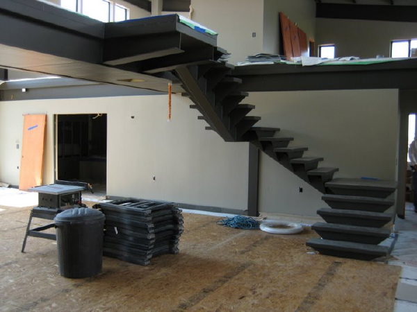
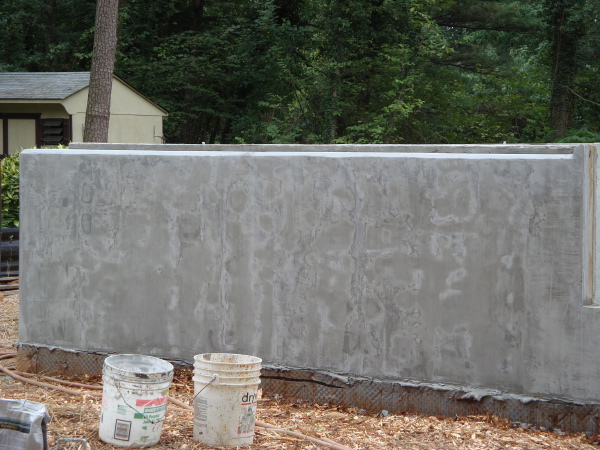 The rest of the crew is sanding reclaimed oak barn boards which will become the ceiling of the ground floor.
 Tune into the
  The episode covers several different house projects, but the Plat House no doubt is the segment described as "a couple who found almost everything used to build their home through Internet shopping."
The first airing of the show will be September 17, 2008 9:00 PM ET/PT with several other airings to follow. See the entire scheudle at the
The episode covers several different house projects, but the Plat House no doubt is the segment described as "a couple who found almost everything used to build their home through Internet shopping."
The first airing of the show will be September 17, 2008 9:00 PM ET/PT with several other airings to follow. See the entire scheudle at the 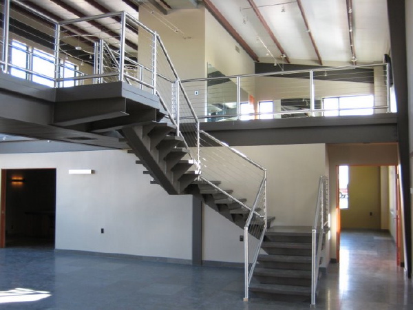
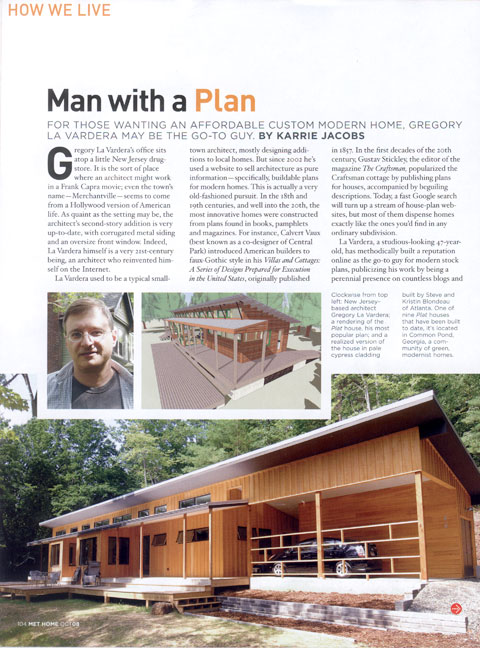 Karrie is a thoughtful observer and commenter on design and one of my favorite design writers. It was the questions that she posed as founding editor of Dwell, about why it was not possible to go out and buy a modern home that inspired me to create this collection of house plans way back at the start. Its really an honor to have it come full circle, to be interviewed by her about the house plans and the whole journey.
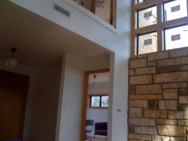 So what do we have here. Well open up the catalog page so you can look at the floor plan. This photo is taken from the living room, looking into the study. We can see a stone wall which is flanking the fireplace, and above it we can see the gridded window wall which sits above the fireplace. I'm real excited about that since it looks like they did a really great job with that. Out the window we can see more of that nicely stained siding. To the left we can see the front door and the entry vestibule. In the study we see the side windows, and a couple of modern chairs? Man after my own heart! And upstairs some cable rail, and a glimpse of the bedroom ceiling. It looks awesome - can't wait to see the rest of the house!
And don't forget the flickr set of photos of
So what do we have here. Well open up the catalog page so you can look at the floor plan. This photo is taken from the living room, looking into the study. We can see a stone wall which is flanking the fireplace, and above it we can see the gridded window wall which sits above the fireplace. I'm real excited about that since it looks like they did a really great job with that. Out the window we can see more of that nicely stained siding. To the left we can see the front door and the entry vestibule. In the study we see the side windows, and a couple of modern chairs? Man after my own heart! And upstairs some cable rail, and a glimpse of the bedroom ceiling. It looks awesome - can't wait to see the rest of the house!
And don't forget the flickr set of photos of 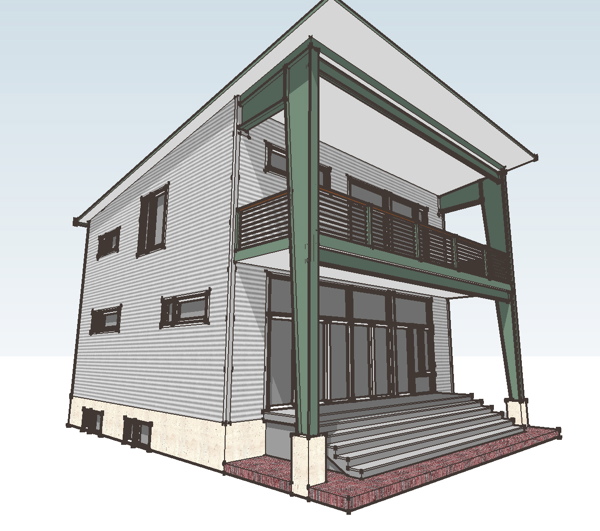 As we described it before, the 3030 House sits on a 30ft x 30ft plus porch footprint, just under 2000 sqft, 3 bedrooms, and a nice open plan living space. It includes a generous kitchen work space and upstairs a large master bathroom, and in the case of this first one a full basement as well. It will fit on narrow in-fill lots or in new compact communities, but its size also makes it a good candidate for a weekend home as well.
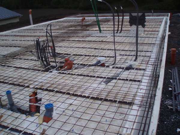
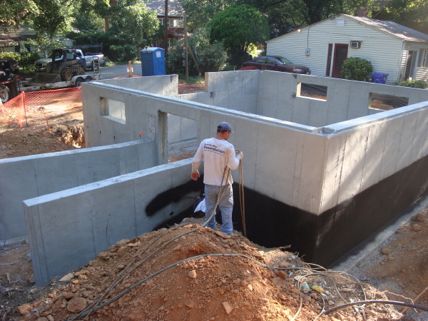 The foundation is already in and steel will being rising this week. Lets look at the plans, beneath the fold.
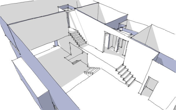
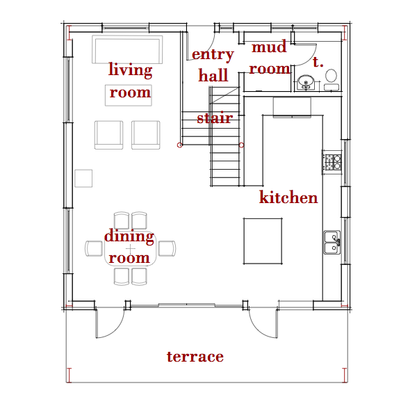 On the ground floor you enter very near to grade level. Here you have a short stair up to the ground floor, and the stair to the basement. To the side is a coat closet and a powder room. Up the short run of steps you land in the middle of the ground floor. To one side is the kitchen island, and the workspace which continues around the corner. To the other side is the dining area. The living room sits towards the front of the house. The open plan allows you to alter the proportion, or location of these rooms. For instance the dining area can be moved closer to the kitchen island and a second seating group added to the living area. If it was me, I'd get a
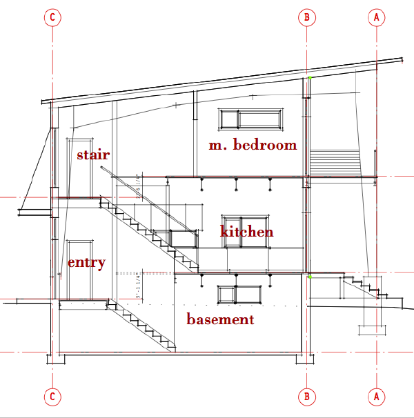
 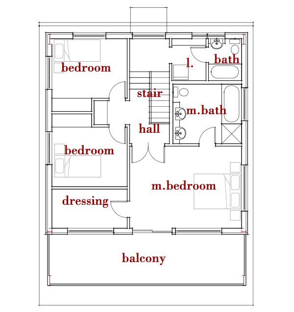 Up the stairs we come to a large landing. On this landing level is a small laundry area and the shared bathroom for bedrooms 2 & 3, At the top of the stairs there is a linen closet between the two bedrooms, and a wide set of doors to the master bedroom. The master has a walk-in closet and a large bathroom with shower and tub. Doors lead out to a balcony that extends the width of the house. Here is a section view where you can see the relationship of these landing levels.
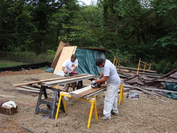
 The compact cubic proportion of the house is efficient with materials, and the floor plan is also efficient with space. The open plan makes it flexible, and gives the impression of being larger than its 1800 sqft would suggest. Into that space we have 3 bedrooms - enough for a family, but not too much to bite off for a first home. See the construction progress in the photo browser below. It starts with the demolition of the existing run-down house and shows excavation, and concrete work for the foundations and basement walls.
 More photos of the frame going up after the fold.
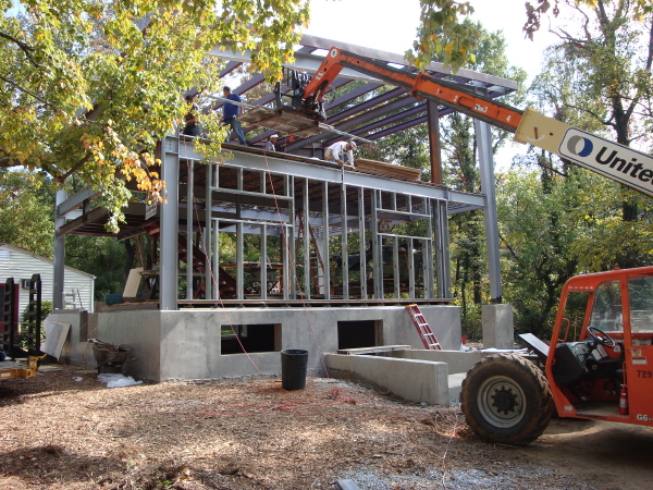
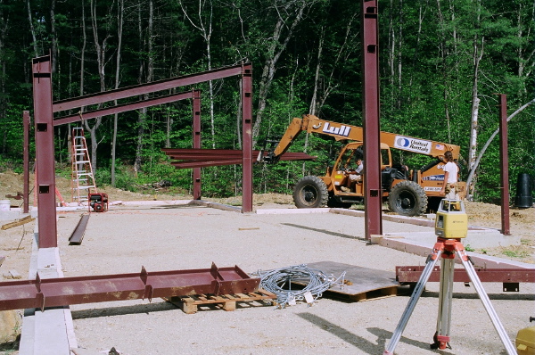 With good access all around the house the work can be done with the all terrain fork lift, saving the expense of a crane.
 Look below the fold for a photo browser with more interior shots.
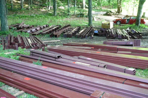 We've watched these go up here before and they generally happen very fast. I'll be posting progress photos in the coming weeks as fast as I receive new photos so stay tuned!
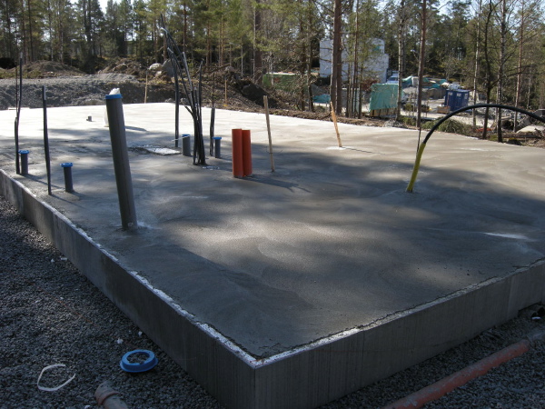
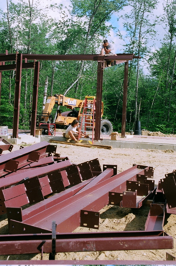
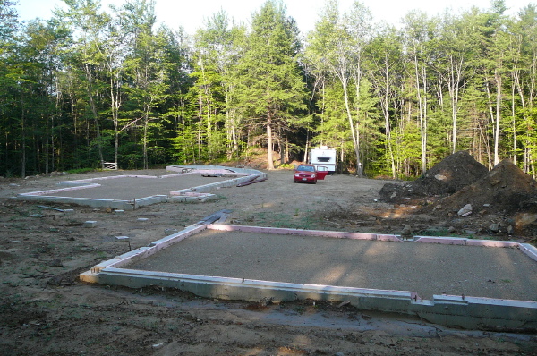 Here is the slab layout ready to receive the steel framing. The garage is in the foreground and the house beyond with the home office at the far end of the photo. More pictures in a photo browser below the link.
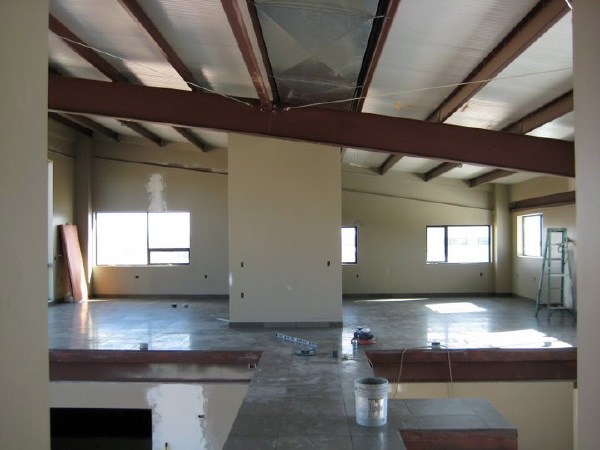 Click through the link below to see a photo browser with more images of the interior and the site.
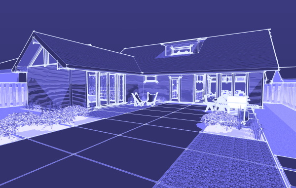
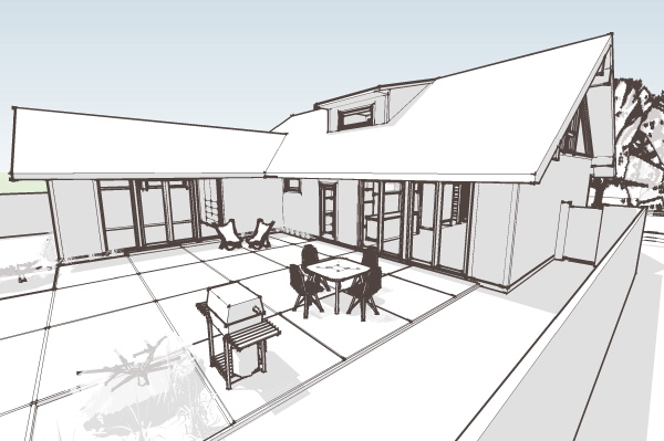
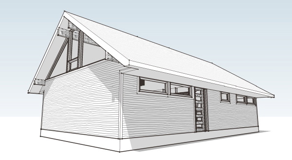 The result of my year long study of the Swedish housing industry, and my love of mid-century modernism, the Hus1 puts these influences together with practicality and livability of the many small 50s and 60s homes in my own neighborhood. The basic two bedroom house will start out at modest 1,350 sqft, or the larger 1,750 sqft 3 bedroom plan shown below. Both have the option of an additional 500 sqft master bedroom upstairs which in the larger plan allows the downstairs master to serve as a family room.
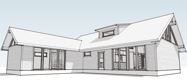 A very livable home, the L shape creates privacy for its rear terrace where family life can flow out from the living areas. Conventional construction makes this house easy to build, and the iconic traditional form won't scare the average home builder.
 Look for Design Prints to come available on the site soon. Well, you will hear about it here when it happens! And yes, this is the house for which we have been experimenting with new drawing styles. Not quite sorted out yet, but when its done the new collection will have a distinct graphic look apart from the original collection of designs.