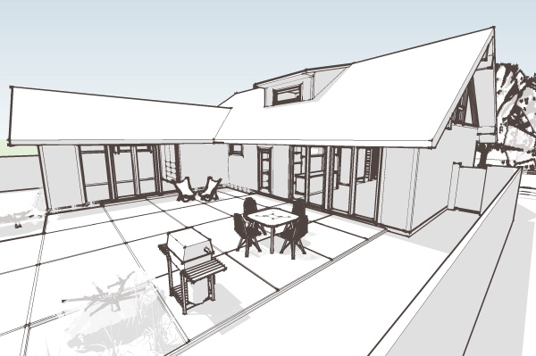
Hus1 - moving towards design prints
categories:
0860 Hus1,
design issues,
modern house plans
Just a glimpse of the site model for the Hus1 taking shape.

Technorati Tags: house plans, Hus1, modern design, modern house
Just a glimpse of the site model for the Hus1 taking shape.

Technorati Tags: house plans, Hus1, modern design, modern house
Posted by
lavardera
at
9/28/2008 11:13:00 PM
![]()
I hate to day it but this reminds me of a 1960's ranch remodel. I think there are enough of those. It lacks the purity and simplicity of your earlier work. It's hard to describe what I am talking about.
ReplyDeleteThat is exactly what it is meant to be. There is a sizable audience out there who can't find a house from that era, or they wish they could have a new house but in that mid-century style. I get emails from them all the time.
ReplyDeleteSo for me its a chance to work in an archetype that I like very much, and at the same time it fills a hole in the market. There will be a seperate collection along these lines, not as many designs as the original collection, but I've got several more house ideas to vent this way.
I am surprised to hear that when most people I know that have a 60's / 70's ranch say so sheepishly - like this is the best deal for the money and at least the lots are large but the houses are so mundane. The first thing they want to do is remodel to make them tuscan or whatever. I think of them as extremely watered down Wrightian prairie houses. All the pizazz and extreme but interesting detail and proportions were take out. I know yours will be much better than the average builder version from fifty years ago but still ... it is very similar. It would be interested to see who is asking for these are they quite young people who are into kitschy retro designs? I love modern architecture but with more geometric extremism or very simple planes, boxes etc. I have seen some great simple scandinavian modern homes with pitched roofs but they usually do not have the overhangs etc.
ReplyDeleteYeah -there you go. People so buried in the status quo they could not even imagine that you would seek out a mid-century house and want to keep it as such.
ReplyDeleteThis is just part of diversifying my plan collection. I'm approaching the completion of the originally posted designs, so I am going to expand into other interests. The first being this line with a retro vibe as you called it. The other will be a series of designs with more minimalist and geometric themes. Some of those will grow out of the design studies done for the suburban house project posted earlier this year.
There is that 'Readymade' magazine which is quite popular and seems like it has a lot of stuff you would find at a garage sale. Oh and don't forget the retro 70's understated apparel retailers like Urban Outfitters... So, yes there is a market, but is it good design? Some might say common, cute, understated, comforting etc. Maybe it is a reaction to everything being branded, dictated and over designed.
ReplyDeleteNo, I think its basically a reaction to the fact that you can not buy a new house like this today. Its a reaction to the fact that builders and developers don't build modestly sized, clean, modern houses. And house plan sites don't sell plan for them either. You might find a house design similar to this in a house plan site, but it would be something held over and 30-40 years old. That's fine, but it has the same issues that keeps some people from buying an existing hosue from that era. They still are not designed for the year 2000, they don't have closets big enough, they don't have open kitchens, they don't have comfortable master bedrooms.
ReplyDeleteThere is more going on here than representing an old house.
Greg, I really dig this. I don't think I would have said I liked a mid-century ranch, but there is an appeal inherent in this plan. Probably the same factors that lead to the original versions: modern, but not so far afield as to scare people concerned about re-sale & the average builder (or owner-builder) could do it....
ReplyDeleteI'm hoping its immune to that modern penalty from builders. I think that when they look at this there won't be any wild unknowns about how its to be built. Similar no objections or ugly looks from neighbors.
ReplyDeleteBut I'm also hoping its small enough for first time buyer, you can hold off finishing the upstairs, or the L, and have a nice sized starter house.
I know you will improve the function of the plan. I think neighbors will not be shocked by it being too modern but they will ask why are they building something so plain and seemingly undesigned or they might ask why they chose a stock plan from forty years ago.
ReplyDeleteThis is just my taste as an lover of both minimalist modern and organic FLW expressionism. I would rather see a cute cottage in some romantic or traditional style with a modern floor. Something that pops. I think you could improve the design by having a log low gable flap along the ridge - think Faye Jones.
I appreciate your instinct to embellish it, but as a house plan this is a case where restraint is not only appropriate, its the goal. The reality is its more difficult for me to steer a project to this place than it is to do something as you describe. Some people will like the house as it is, but most will project on to it as you are doing. Some will see it as strongly mid century, others trimmed out as a cape cod. As a product this is where it needs to be.
ReplyDeleteIt will be interesting to see where it goes - and how people might personalize it. It would be nice if you could get photos of every finished house. Maybe you could put a note on your plans to send in a photo!
ReplyDeleteGood luck!
I think the variations we see in the Plat House are a good indication of where it would go. There are even significant variations in the two Tray Houses we've gotten photos of, and the Porch House in Texas was altered by the owner as well.
ReplyDeleteI looked back at your previous post, and I really do like this plan. I could actually see living in it easily. Roughly how large is that dining/living area? I would guess around 28x14 just looking at the surrounding rooms.
ReplyDeleteI can't wait to see the finished product!
You are right on christopher, give or take a few inches.
ReplyDeleteI'm very interested in how this design might turn out. I currently live in a mid-century modern (1963), but, like Greg said, the houses just aren't designed for 21st century living. We love our house and we'd stay here forever IF we could change a few things. instead, if we could find a MCM inspired but updated plan, we'd definitely be interested in building an updated MCM design. In fact, we've considered having an architect have a go at updating our house.
ReplyDeleteSo, speaking perhaps for others in my situation (and I know of some others), I think this plan (and related plans) will be welcomed.
Thanks for that feedback Steven.
ReplyDeleteGreg, you are entirely right about there being a desire for mid-century style homes. I continually find myself drawn to these little jems when I see them and am happy you are exploring this avenue again. You also touched on one aspect of these houses that we are unable to overlook - builder friendly and covenant friendly. There many of your house plans and other modern plans I would love to see constructed that are outright dismissed due to restrictive building covenants. It's another version of NIMBY. Take the Palo Alto, for instance. Where I live this house could never be built in any current subdivision because nearly every builder/developer dictates the pitch of roofline - 6/12 and up. Think of the number of modern house plans that immediately get tossed aside as a result. One developement I found had nearly 3 pages of covenants that had to be met or avoided. It's no wonder we have row after row of cookie cutter houses. It's my sincere hope that your new Hus plans bridge the gap - a modern house inside with classic mid-century styling outside that will meet the approval of the building/developement dictators.
ReplyDeleteThank you for validating those ideas.
ReplyDeleteGood news, the design prints are done, and this morning I need to update the catalog pages to show the Hus1 and introduce the new Collection organization.
I think the design is reminiscent of the work of Joseph Eichler. His work was an understated, yet well designed ranch home for the middle class. I like it, I wish I had one.
ReplyDeleteNice work Greg.
Jake
yeah, its sort of like a Cape Cod meets Cliff May kind of hybrid..
ReplyDeleteI love this plan! I'm obsessed with the house from the show Ozark, and this is very similar. Did anyone ever build it so we can see some real life pictures? I'm not sure of the exact measurements on this, but assuming the spacing is appropriate for aging in place, etc. it is exactly what I am looking for.
ReplyDeleteHi Trina –– no built examples yet, as the Construction Prints of this design are not completed yet. If you are interested we can do a pre-order which will put them into production, and have them available in 1-2 months. But the first step us usually getting the Design Prints and taking a closer look at the design.
ReplyDelete