window locations - XHouse1
I mentioned this week on the Twitter feed that I was working on the window locations for this new house design. Without an actual site putting pressures on the house from the outside, or an owner's desire for furnishing of the inside to work from the only thing leading the window placement is composition. The windows in question are for the rear corner of the house where the master bathroom resides above the home office/studio space.

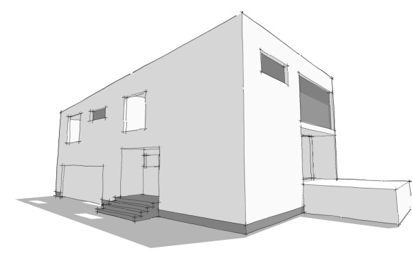
This is an image from the very early sketch model shown on the earliest posting of this design. At this point I had not located any windows for the studio, and had anticipated one high horizontal window in the master bathroom. As the planning of the interior progressed we ended up with the sinks on the rear wall where the high window was shown. I would rather not place a window above the sinks and mirror so that became a strike against this high window. Also I was coming to the conclusion that the massing of the house should reflect the large open space of the living/dining/kitchen that runs front to back, and the more cellular division of the bedrooms, bathrooms and smaller spaces. I think that the two end facades consisting of a contrast of big windows and solid walls worked to reinforce that. But that would mean that the high window in the bathroom worked against this. Strike two for the original bathroom window. Continues after the link below.

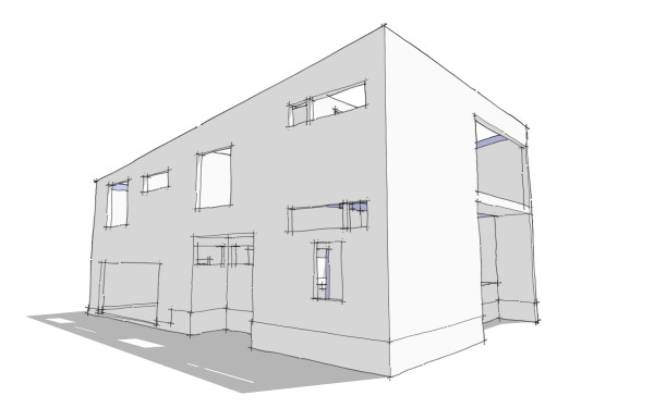
Now this is where it is right now. The master bedroom window wants to be on the side of the house, and it spans over the tub and into the toilet room. Now below in the home office/studio there are two things going on. Number one the space is tall, a story and half because it is under the master bedroom, the highest level of the house. To emphasize the height I really wanted to have a window high on the wall of this room. I also want a window in this room down at eye height, and I want it to conform to the code requirements for a sleeping room so that this can be used as a guest room if desired. In the sketch above I've taken a first shot at placing these windows, the high one corresponding to the master bathroom above and a smaller one below. My problem is that I don't think these are keeping with the DOT-DASH-DOT rhythm of the other windows on this side of the house. The horizontal window at the master bedroom I think is fine, but the two in the studio are making too much "noise".
So there are a few options. I can replace the two windows with a single larger window similar to the two upstairs bedrooms. This will forgo the high window for this space. Or alternatively I can move the high window for the studio around the corner to the back wall to get it off the side facade, but this will violate the solid/void relationship of the end walls that I want to maintain, similar to the earlier sketch. That's what I'm working with right now.


No comments:
Post a Comment