first take on interior views - XHouse1
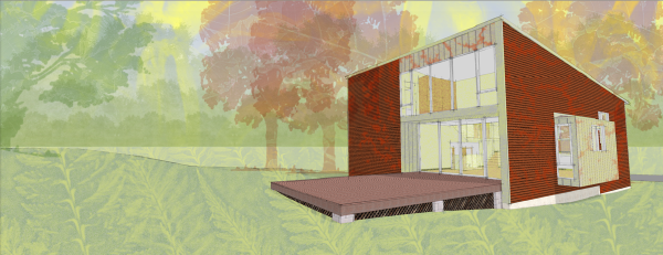
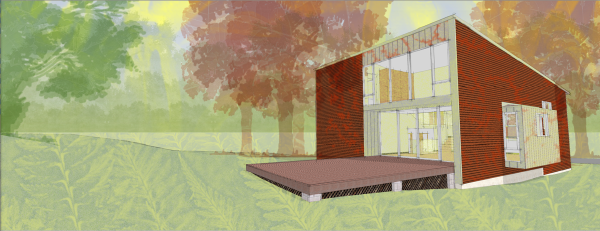
Opinions please: do you like A. the saturated, grainy, high contrast version, or B. with more subdued and even tones but more highly patterned walls surfaces.
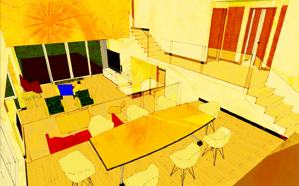
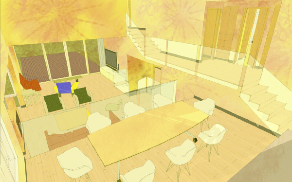
Opinions please: do you like A. the saturated, grainy, high contrast version, or B. with more subdued and even tones but more highly patterned walls surfaces.


Posted by
lavardera
at
4/28/2009 12:07:00 AM
9
comments
![]()
My faithful correspondent Scott has forwarded a link to another interesting video showing the inside of a Finnish house factory, this time from manufacturer Lapponia, which is again typical of techniques used in Sweden. Again there is a mix of manual assembly, and big automation machines.
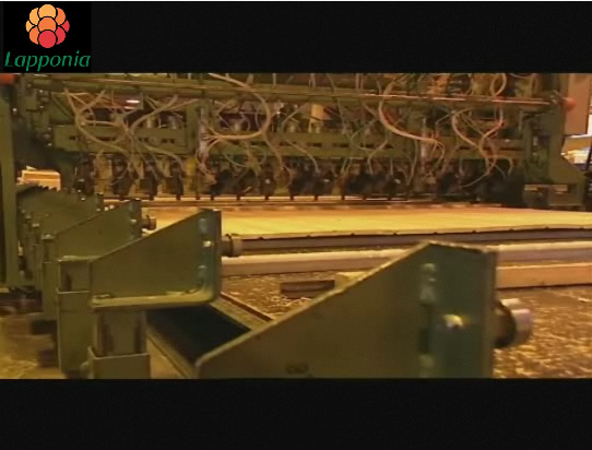
In some stills from the video we see the wall panels being laid out on the large "tables" and filled with what appears to be a very dense fiberglass batt insulation, not like the fluffy stuff we have in the US. In the clip you can see the insulation material being cut on a special table with a rolling blade.
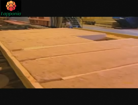
In this part of the film the company executive is explaining the construction of their wall panels. What we see here is a stud wall which looks to be closer to our 2x8 size than our 2x6s. That 2x8 stud wall is filled with the dense insulation, and then there is a second insulation layer on the outside of the wall, adding another 3" or so of what looks to be a rigid fiberglass panel. And finally on the outside of this is a heavy tongue and groove siding panel.
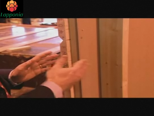
Its clear that the Swedes are achieving some very high performance houses using this construction. No SIPs, nothing unfamiliar to any US carpenter. They are just stepping it up. Up to 2x8 thick walls, filled with high density insulation. They are adding a second continuous insulations layer outside of that to fight the thermal bridging of the studs, and finishing it with a substantial and long lasting siding panel. This is something we could be doing here today.
Lapponia no longer has the factory video posted to their site, but their online catalog is here: Lapponia
Links to past entries in the Letters from Sweden Series:
Letters from Sweden - automation in the factory
Letters from Sweden - the foundation
Letters from Sweden - deliver and set
Letters from Sweden - plumbing the prefab
Letters from Sweden - wiring zen
Letters from Sweden - a windows tale
Letters from Sweden - panel building in Sweden vs the USA
Letters from Sweden - Europe is different, Sweden is not, sort of..
Letters from Sweden - land of modern, land of prefab
Letters from Sweden - conversations with an expatriate builder
Continue reading "Letters from Sweden - another peak at the Swedish factory"
Posted by
lavardera
at
4/27/2009 11:17:00 PM
3
comments
![]()
This is the same view posted earlier, but processed. I finally managed to get the leaf texture to show up on the trees, but its made them so light the image has lost contrast. More tweaking to come.
Posted by
lavardera
at
4/23/2009 04:21:00 PM
0
comments
![]()
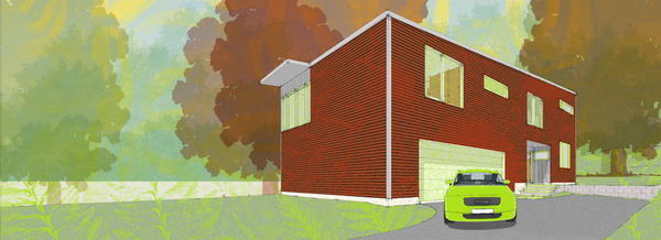
A lime green TT that is. I think I'm happy with the "atmosphere" here. Now to see if I can repeat it...
Posted by
lavardera
at
4/20/2009 11:47:00 PM
3
comments
![]()
Posted by
lavardera
at
4/17/2009 12:42:00 PM
1 comments
![]()
Another dozen photos from the owners of the Texas Plat House today. They have installed rails around the decks and they look great.
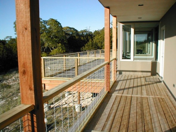
Several of the houses that have been built from our plans have used cable rail, both for decks and for inside rails on the two story houses. Cable rails are great, because they are very transparent, and when you are surrounding your deck with railings its nice to use something that is fairly transparent so you can see the landscape beyond. The only downside is cable rail components can be expensive if you go with the nice hardware sold for this purpose. You can buy turnbuckles and crimping hardware and do it yourself for much less, but the Owners of the Texas Plat House came up with a great alternative.
Hog Panels. Thats right, Hog Panels. Welded wire mesh panels meant for building hog pens. You will notice that there are more horizontal bars at one end - this is typically put at the bottom of the pen to keep the hogs snouts in the pen. But they have turned them over. The heavy welded wire will be very durable, and its at least as transparent as a cable rail installation.
See more photos at the Flickr set for this house.
Continue reading "Texas Plat House gets handrails"
Posted by
lavardera
at
4/13/2009 03:01:00 PM
16
comments
![]()
I recently watched a very interesting TED talk by Joseph Pine about consumers demanding authentic experiences from the products they purchase. I really love the way he is looking at this and I thought it wold be worthwhile sharing it with modern house fans.
He begins by explaining the evolution of consumer demands. In the beginning there were only commodities extracted or grown, with little differntiation. Later goods were made from these which gave way to brands and unique products. But eventually even these began to feel like a commodity. The response was to customize goods for the customer - a service. But even services began to be commoditized which brought the focus on the consumer experience. Now with the goal to provide the consumer a desirable experience, the drive is to offer authenticity.
He goes on to define two ways to be authentic:
- Be what you say you are.
- Be true to yourself.
He then sets up a matrix where you can evaluate things against these two questions, answering each with Fake or Real.

How does the range of housing we see every day fall in this grid? I see it this way:
A McMansion is undoubtably Fake fake. It purports to be a fine old house, but it is not what it says it is. It is most certainly not an old house. It does not follow the design tradition, nor employ the proportions or detailing of an old house. It is clearly a new house. And it is not true to being an old house either. It has a garage on the front, and contemporary features that old houses never had.
Now let's consider a historic recreation, such as a house in Colonial Williamsburg Virginia's historic village. This recreated house is a Fake real. Like the McMansion it is not an old house - it was built recently and for the most part its not even a house. Nobody is expected to actually live there. So it is not what it says it is. But it is true to being an old house, built with colonial techniques, and none of the contemporary features you see in new houses - no garage, no media room, no granite countertops. It follows the form of a true colonial house. It is true to itself.
Now lets look at the work of a contemporary architect designing in a classical tradition. For example, Allen Greenberg, a well known classical designer. For the most part I would say this kind of work is a Real Fake. It is what it says it is in that it is true to the classical tradition in its design, proportion, and detailing. But it is not true to itself in that it is built with contemporary materials, and contemporary techniques, it has good wiring, it has the media room, and other contemporary features that people demand in houses today but were never in a house of the era that the building tradition was popularized.
So what would be a Real real? Well I think a genuine old house is a Real Real. It presents itself as an old house true to design principals of days gone by; and its true to itself as it is built as such by definition. In most cases a moderately old house is livable more so than a colonial house without indoor plumbing! There are houses of all styles that would fall into this category, including mid-century modern homes, and iconic houses like Mies's Farnsworth house, Fallingwater, etc which were true to their times. At the other extreme I also think an contemporary modern house could be Real real if it is one that postures the home as a product of todays building techniques and domestic life, and does not fall back on any past iconography. But obviously not all contemporary modern houses would fall into that.
And I think that is ok. All homes will fall into an area between these extremes, and what is most important is that when the level of authenticity is great, contributed from either one or both sides of the authenticity question, then the houses will be liked by consumers. For instance, a house built in the classical tradition may be very strong in being what it says it is, but weak in not being true to itself. But the level of authenticity derived from designing to these traditions greatly overrides any negative or fake sentiment from the accommodation of everyday expectations.
Similarly a historic recreation like Williamsburg is greatly loved by the public despite the fact they know it is not old, yet few would ever wish to live with the compromises that come along with it being true to itself. In both cases the high level of authenticity drives the consumer's experience of the product.
I think a modern house can play with high levels of authenticity in both categories. It can be what it says it is - a house built for today's world, with today's lifestyle in mind. And it can be true to itself - unabashed about contemporary construction, and willing to jettison traditional arrangements of spaces in order to make a home that matches today's lifestyles. But being strong in both sides also gives us the leeway to indulge in some nostalgia for the modern tradition without resorting to being fake. I believe that this potential for a high level of authenticity will contribute to a growing popularity of modern houses.
Here is a link to the video, its not too long and well worth taking in:
Posted by
lavardera
at
4/12/2009 08:26:00 PM
3
comments
![]()
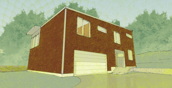
More experimenting with graphic tools, another view of the XHouse1
Posted by
lavardera
at
4/07/2009 12:20:00 PM
2
comments
![]()
Just as we started with a new look for our illustrations in the Blueprints Collection, we are looking for a new look for the X-House designs. We are trying new software that gives us a new set of tools.
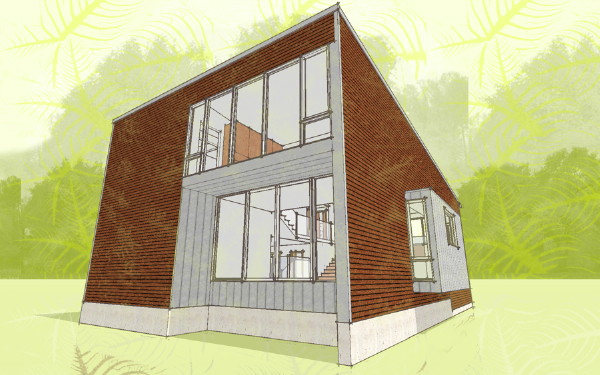
This trial is not radically different than our Original Collection drawings because we've started in the same place. But we are playing with the tools to lay down patterns and atmosphere over the images. This is a first glance at the house with the rain screen cladding.
Continue reading "experimenting with new illustration styles - XHouse1"
Posted by
lavardera
at
4/05/2009 03:40:00 PM
0
comments
![]()