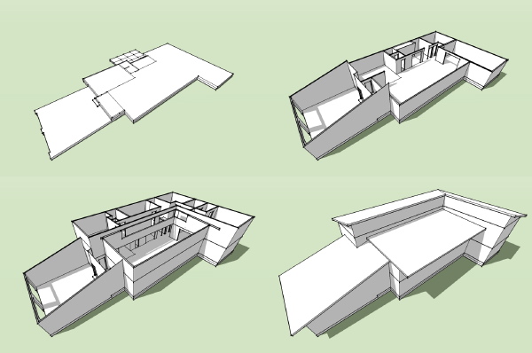
0857 L House - model takes shape
Building, building, building...
Technorati Tags: house plans, L House, modern design, modern house
Continue reading "0857 L House - model takes shape"Building, building, building...

Technorati Tags: house plans, L House, modern design, modern house
Continue reading "0857 L House - model takes shape"
Posted by
lavardera
at
5/27/2008 11:16:00 PM
0
comments
![]()
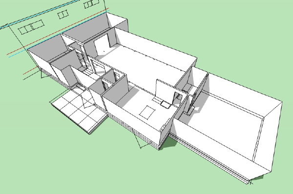
The next design print in progress.
Technorati Tags: house plans, modern design, modern house, L House
Continue reading "Guess the upcoming house plan"
Posted by
lavardera
at
5/26/2008 11:02:00 PM
2
comments
![]()
A few new photos from the owner of the Virginia Plat House today. The siding is all done and the exterior more or less finished. The interior work is beginning now.
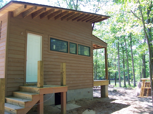 Here is the master bedroom side of the house. I liked this photo because it gives you a good look at the side overhang rafters. They did a good job with this detail which is always gratifying to see. You can also catch a glimpse of the creek in the distance - what a great setting for this house.
There are three new photos of the house posted at the flickr set for this project. Also remember to look at the LamiDesign Flickr photo pool to see all the photos from customers documenting the house designs under construction. Our thanks go out to them for sharing their projects with us.
Technorati Tags: house plans, modern design, modern house, Plat House
Continue reading "Virgina Plat House - exterior complete"
Posted by
lavardera
at
5/21/2008 11:08:00 AM
0
comments
![]()
Today we will look at the next scheme from the suburban house project. This scheme came later in the process and so the sketches are more fully developed than the other schemes we have looked at. In this scheme we returned to the idea of the gathering of spaces around the living room, with the secondary spaces seeking a physical connection back to the center of the house. We also struggled to find a way to make a positive solution to the need to elevate the plumbing in the house above the septic system without lifting the entire house out of the ground and compromising the connection to the landscape or bringing in large amounts of fill. What we arrived at was a rather complex interior space arrangement which followed a multi level path through the house, but existed within a simple massing under a simple roof.
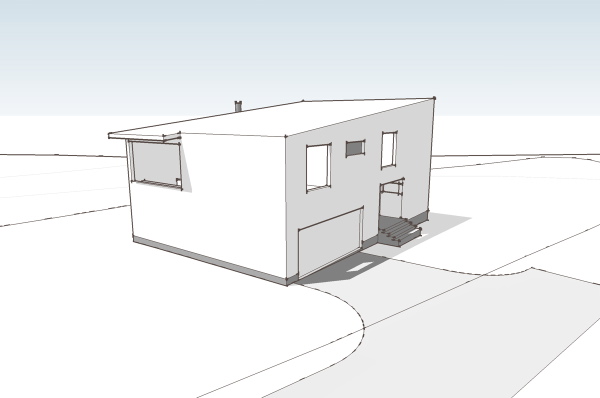 I think the house is difficult to understand from floor plans, yet we'll look at them anyway. Those of you who can read plans well will enjoy the jump from flat-land to seeing the space in your mind. For everybody else we'll look at some better representation further down.
click below to continue reading..
 So on the ground floor you arrive at the house at what is a very ordinary suburban situation - a garage door flanked by a recessed entry. This gives way to a small vestibule which is also joined by the entry from the garage. Adjacent to the entry is a nice sized home office/studio space. This is great for home office workers as it is removed from the rest of the house and is even workable for taking meetings without parading through the home. From the entry you proceed up a third of a level to the living room - a small stair.
 You arrive in the living room space, a high story and a half space. Straight ahead is a fireplace with niche on either side (actually not drawn on plan), to the left is the kitchen and dining area, which is another level up, and to your right is a more intimate area with a lower ceiling that has a window wall facing out to the site. Take the short steps up to the kitchen and you have a large table area that overlooks the living room. The kitchen has a large island, and another counter at the wall. Above the countertop is a large window looking out at the front of the house. At one side is a pantry space and another short stair that brings you up to the bedroom level.
 The bedroom level has short hall/balcony that overlooks the living room. The two bedrooms share a bath room and have windows overlooking the side of the house where the entry door is located. At the end of the hall is yet another small stair that takes us up to the master bedroom level. The master bedroom bridges back over the living room on the left, and to the right has a large area for closets and master bathroom. Unlike the other bedrooms it is very isolated and feels removed from the rest of the house.
 This section view above gives you a pretty good idea of all these level changes, but this cut away view is probably even better for understanding the layering.
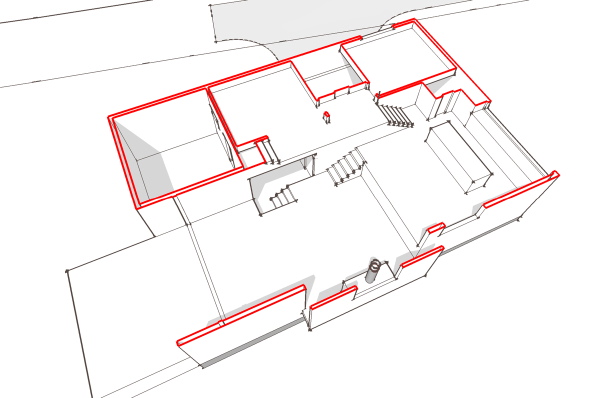 And here is a rough walk through of the sketch model which will give you the best representation of the space and how the parts relate to one another.
I liked this solution as its simple geometry was efficient and economical yet it provided a very dynamic interior space that served the program. Right now its my favorite candidate for conversion into a stock plan.
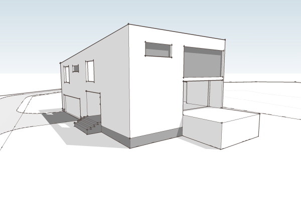
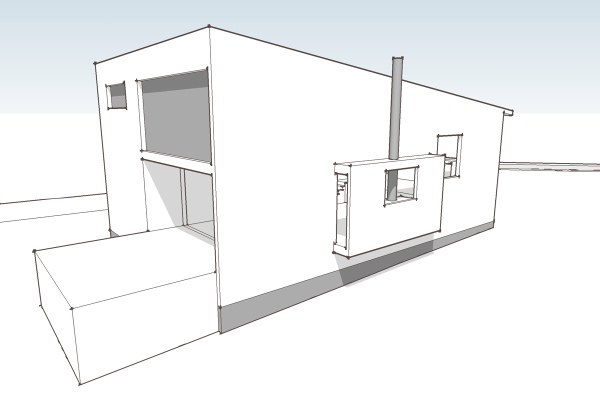
Technorati Tags: house plans, modern design, modern house
Continue reading "0751 Suburban House - fourth scheme"
Posted by
lavardera
at
5/19/2008 05:28:00 PM
6
comments
![]()
This is tangental to my blog, no doubt, but the state of the housing industry is relevant to our interest in the resurgence of modernism as a housing product. If you have money to build or are able to borrow in this credit climate, its actually a good time to build. And that's an opportunity for modernist to get a foot in the door, for developers flat out of luck its a market that still has demand. So read up, or listen up as the case may be, and learn what actually went down in the credit bust. This radio program "This American Life" just did a review of the recent history of the ongoing credit crisis, and the housing crisis it spawned, and the overall stinky economy following on its heels. This is the best plain language, easily understandable account of what has transpired that I have heard to date. It was put together by a pair of reporters, one a financial correspondent for NPR, and the other a regular from This American Life. So it puts together accurate financial reporting with a human outlook and good story telling. If you think "yeah, I know there is a credit crisis but I don't really know what just happened" then this is a worthwhile listen. It puts it in very human terms as well - via the experience of a lot of people who participated in it. I'd really love to blame somebody. Sure there was greed in there, but not nearly as much greed as sheer stupidity. You know, its like those C students I went to high school with, the ones that were not nearly as smart or responsible as me, but today make so much more money than I ever did or ever will. Its like these are the ones we leave our economy to. And they'll put it into a tree on a joy ride as readily as they did with their dad's Old's Cutlass back in high school. http://www.thislife.org/Radio_Episode.aspx?episode=355 These podcasts are only available as a free download for a week, starting this past sunday. So get it now or pay later.
Technorati Tags: modern design, modern house
Continue reading "A coherent account of the Housing Boom/Bust"
Posted by
lavardera
at
5/13/2008 12:03:00 PM
3
comments
![]()
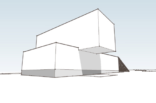
Time to look at another schematic scheme from the suburban house project. This scheme was centered around an interesting idea about how to organize the house, but also departed from the previous schemes because of this. Here the living+dining+kitchen space is imagined as a glazed rectangular volume set atop a plinth containing the rest of the functions of the house.
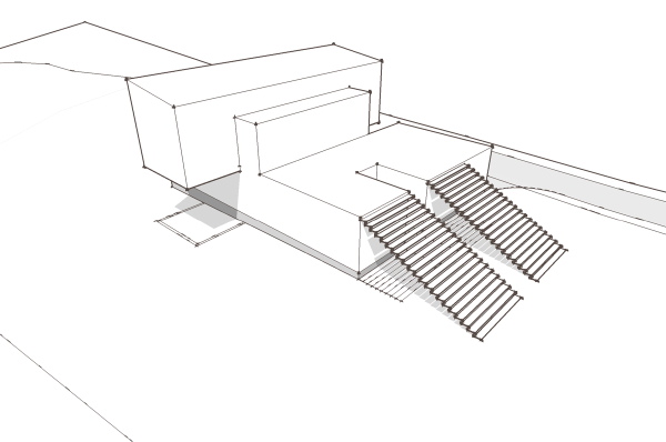 This may be a little bit harder to imagine because the schematic model really does not give a good representation of how this would be integrated into the landscape. The plinth would be masonry, sunk into the earth, the stairs at the front looking like a bit of a ruin, emerging out of the landscape (which with fill needed for the site would not be as long as shown in the illustrations). The bar atop is lighter, framed, with many windows, cantilevering off the base on both sides.
Click the link below to continue reading.
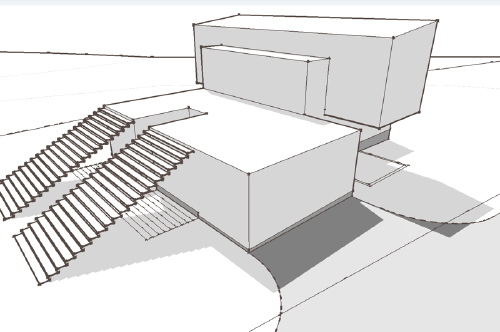 When you approach the house there are two ways to enter. If you go up these steps at the front of the house you then walk across pavers on a green roof to a "front" door in the living dining kitchen bar. There is a smaller volume extending towards the front of the house here which is relatively solid, and beyond it the volume of the bar is more transparent. You enter through the door and step into the broad view through the bar into the landscape beyond. Another green roof and roof terrace mediates between the room and the landscape.
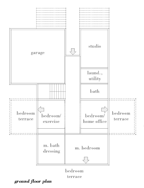
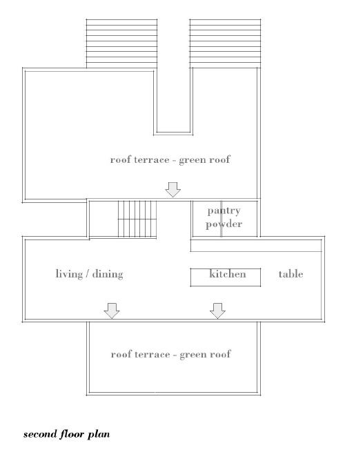 The second way to approach is to descend into the grotto that exists between the pair of front steps which will take you to an entry door. This door brings you into a center hall at the lower level of the house. The home office and studio is to one side, and the entry to the house from the garage is at the other. Beyond is a stair with light descending from above, and further the two secondary bedrooms. Each of these rooms is at grade and has a small patio, its own private outdoor space sheltered by the bar above. At the end of the hall is the master bedroom suite which also has its own patio at grade extending off the end of the house.
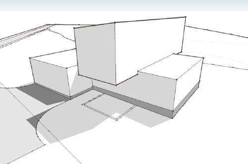 I've tried to describe the house more as an experience, since this rough model does so little to describe the definitive characteristics of the house. This proposal did not meet the brief for the project in many ways, but it still remains an intriguing idea for me. Perhaps it will find its place as a house plan in the future.
Technorati Tags: modern design, modern house
Continue reading "0751 Suburban House - third scheme"
Posted by
lavardera
at
5/11/2008 08:04:00 PM
2
comments
![]()
This plan set has been kicking around on the back-burner for a few years now. I had created the Design Prints and started on the Construction Prints, but set it aside to develop other designs. Its nice to have four variations on the Steel Case House, but getting other designs published took priority. But I'm in spring cleaning mode now and it was time to finish this and get it online.
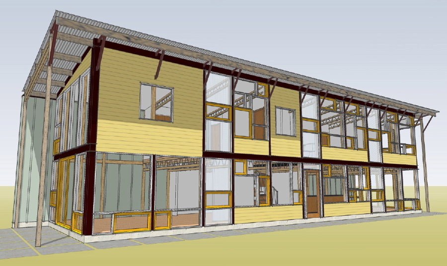 The Timber Case House differs from the rest of the Steel Case line in that it substitutes an engineered timber frame for the steel frame that gives the line its name. The SIPs entry wall and roof increase the performance of the building envelope making up for the vast glazed area on the back side of the house. If you have not studied this design in while now is a good time to take a second look.
0357T Timber Case House
A few more plans sets to go and the initial collection will be complete.
Technorati Tags: house plans, modern design, modern house, Steel Case House
Continue reading "0357T - Timber Case House, Construction Prints Done!"
Posted by
lavardera
at
5/04/2008 10:31:00 PM
2
comments
![]()
In our last "Swedish Prefab" installment we looked at the innovations in electrical wiring and compared the round Swedish outlet boxes and plastic flexible conduit with loose conductors to the American system of square boxes and shielded wire cables (Romex). These Swedish products are not in the US ... yet.
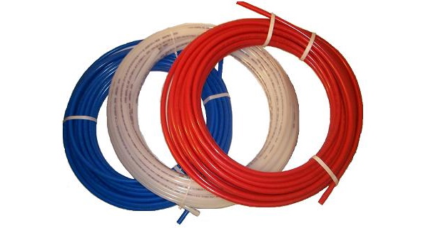
Plumbing is another area where there is noteworthy innovation in Sweden. However this innovation has made it the USA and is something that is rather common: Cross Linked Poly Ethylene or "PEX" tubing.
 click the link below to continue reading
A brief history: German chemist, Thomas Engel, invented the process for making this tubing in 1968, which he licenced to the Wirsbo Co. in Sweden. Wirsbo introduced PEX floor heating in Europe in 1972, and for potable water supply in 1973. The US market didn't see PEX until Wirsbo set up an office in Minnesota in '85 to market their technology. In Sweden today PEX is used in almost every job – and radiant floor heat is installed in 50% of the houses. While becoming more popular radiant head is not nearly as common in the US. Wirsbo is now part of the Upnor company, and numerous other manufacturers make and market PEX tubing systems. More info can be found:
http://www.uponor.com/about/about_6_1.html
http://www.theplumber.com/plumbinginventions.html
http://www.ppfahome.org/pex/faqpex.html
While numerous qualities account for PEX market share growth in the US and elsewere, our concern is how this new kind of plumbing facilitates off site construction.
One way to look at this is to consider how traditional systems make off site construction more difficult. Rigid pipes, such as soldered copper tube, must be cut to very exact lengths and turns made with soldered elbows that can be unforgiving during handling. If a pipe was hit during handling joints hidden behind finishes could easily be damaged. Field joints in the pipes would either have to be stubbed out of panels and fed through adjacent work without damaging them, or left cut off within the wall panel, and that wall panel left unfinished in order to make the plumbing connections. All of which makes the process more difficult.
With PEX, the flexible plastic piping can simply be left in a small coil where it exits the panel and easily passed through a hole in adjacent work to be connected later. It is a very rugged mateial, and it flexibility contributes to it ease of installation and durability during handling. Because of this it is possible to plumb and ship the walls with the plumbing in place, and to easily connect the the piping after the panels or modules are installed.
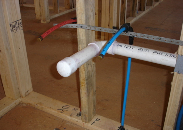 Although the US didn't see this technology until 15 years after it was invented, almost every plumber is familiar with the system, as are inspectors – and the uphill battle of changing standard practices in construction was undertaken by Wirsbo who saw the reward of gaining sales in the US market. The nature of product vs. system type of technology is interesting to note here - since pex tubing can and is often connected to standard copper fittings for the final connections in US plumbing fixtures.
The Swedes also have a distinct approach to plumbing fixtures. This might not at first seem like an area that has anything to do with prefab construction, but in reality, the rationalization of the pipes and fixtures all fit within the "off site" and "low labor" model of Swedish building systems.
In Sweden plumbing fixtures are treated more like appliances than built in work. For instance bathroom sinks are commonly surface mounted, with the supply and drain pipes serving them all exposed underneath. Bathtubs typically don't have the filler spout and valves mounted to them - they are on an adjacent wall. The tub usually is not connected to a drain pipe either - rather the tubs which are often on legs like an old fashioned claw foot tub simply dump out the bottom to a floor drain located under the tub. They have no hard connection to the house plumbing at all. Home owners shop new tubs te same way we might bring a frig or microwave into our new house.
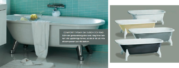 So a bathroom in a Swedish prefab when its delivered is typically an empty room with the various plumbing connections ready to receive fixtures. This greatly reduces the complexity of the finished product. No cabinets to install, no tubs to set, no tile to fit over the plumbing fixtures, no shower pans with numerous angles and intersections. There are none of the fussy rough framing issues, built ins, and other work that usually make bathrooms the most expensive part of completing a house. There is nothing in this method that would prevent a bathroom from being finished out in a way that was more familiar to Americans. But what is key is that in Sweden it is customary for the builder to prepare the house to receive the bathroom fixtures which the homeowner can select in a "plug and play" fashion from the range of possible products.
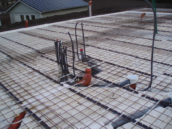 When you look at the foundations for a Swedish house you see a slab with pipes located at the planned locations ready to connect using the flexible Swedish system – indeed the plumbing has been rationalized for prefabrication. As with the windows, wiring, and other systems we've looked at, everything is designed to work in concert with the prefab process.
With our slab ready to receive the walls, the next step is to deliver the house and connect all the parts on site.
Thanks to Scott for photos, links, and cross editing with me.
Previously:
Letters from Sweden - wiring zen
Letters from Sweden - a windows tale
Letters from Sweden - panel building in Sweden vs the USA
Letters from Sweden - Europe is different, Sweden is not, sort of..
Letters from Sweden - land of modern, land of prefab
Letters from Sweden - conversations with an expatriate builder
Technorati Tags: modern design, modern house, prefab house
Continue reading "Letters from Sweden - plumbing the prefab"
Posted by
lavardera
at
5/04/2008 10:08:00 PM
0
comments
![]()
We have not seen any photos of the Colorado Plat House since last August, so you can imagine my surprise to see a bunch of photos of the finished house in my inbox this week. I was blown away - what an amazing setting! There may be a few loose ends that we can't see, and there are no furnishing yet, but all the same its an amazing sight. Have a look below.
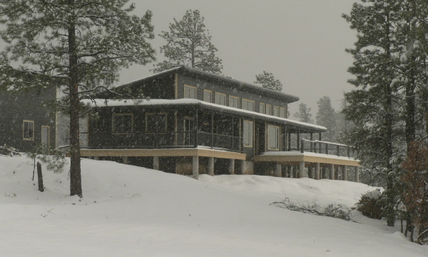 continue for more photos by clicking the link below.
In the photo below, which appears to be shot from a plane or helicopter, you can see the wrap around porch roof which is a unique feature of this build.
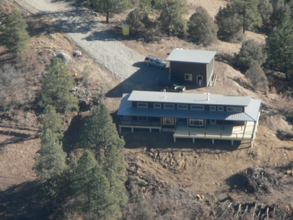 The owners have really had some fun finishing the interior - its like no other Plat House we've seen before. There is a corrugated metal ceiling and what appears to be cork floors. Look through the photo browser below to see some interior photos.
Technorati Tags: house plans, modern design, modern house, Plat House
Continue reading "Colorado Plat House - house complete"
Posted by
lavardera
at
5/02/2008 06:10:00 PM
1 comments
![]()