0751 Suburban House - project background
In a departure from the usual blog topics here I'm going to be starting a series of posts about local project, a custom home, that I've designed for a client here in the Delaware Valley region. While this is not a stock plan or a prefab several of the design schemes that we abandoned during the design process may ultimately find a second life as a house design in our stock plan catalog. So, while we will eventually arrive at what was the final design, its going to be more about the journey and looking at the sketches of the house designs we left behind, and seeing if any of them generate some enthusiasm and longing! Lets begin with some background on the project so you can understand some of the influences, pressures, and limitations imposed on the design.
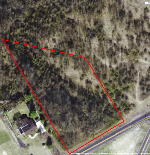 The site is a parcel of 3 acres in a low density suburban zone outside of a small college town. The proportion of the property is a narrow rectangle with the rear closing to a point. A good deal of the front end of the site is consumed by wetlands, and its wetland transition zone, which can not be disturbed. This moves the home site towards the center of the lot, a good distance from the road making for a fairly private setting. This influences issues about how the house presents itself upon approach. Does it want to have a prominent "front" door when it really does not have a street life, or should it focus on the inevitable vehicle arrival?
click the link below to continue reading.
Another strong site influence oddly enough is the septic system. The septic design called for it to be located on the highest spot on the site, gaining the most distance from the relatively high water table. That meant that the home site was actually pushed down slope from the septic site, but if to remain on gravity feed to the septic then the house had to be at higher elevation. This put the first floor level of the house a good distance above the natural grade. So where the natural inclination would be to meet the landscape casually we were at a height above it, as you might be in an urban townhouse, except it was not driven by a need for privacy, but rather from the technical demands of the site. We were facing a contradiction that we would have to attempt to resolve.
The house program consists of 3 bedrooms, 2.5 baths, in about 2400 sqft plus a home office/studio space and a two car garage. Ample area for what is a very common program of space. Tempering it was a desire for an open plan living, dining, kitchen and "gathering" of the two secondary bedrooms around the living space - encouraging their casual use for other functions for exercise and home office and the occasional guest. An interesting condition, yet it could not undermine the use of the rooms in a more conventional mode by a family with children.
We explored several different alternatives which I will briefly introduce here. In entries to follow we will look at each design more closely. Some of these were developed only very roughly, and some not even worth showing here won't make an appearance.
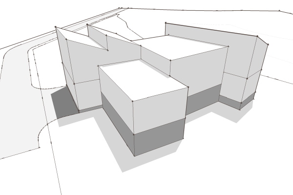 Gathering the rooms around a high ceilinged living space.
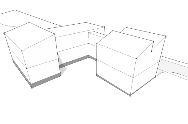 Creating an entry forecourt between the garage and house.
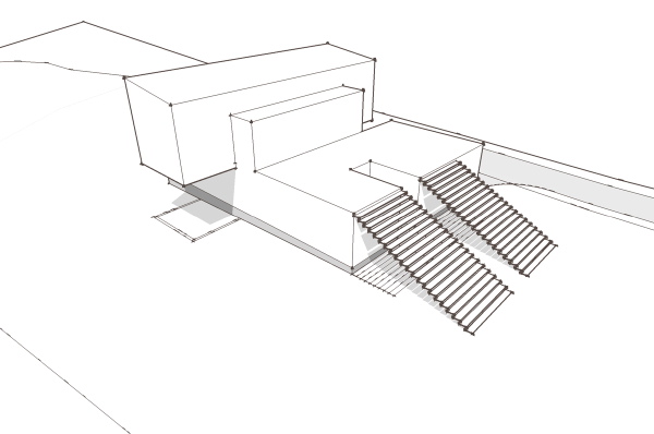 Living spaces on top of the remainder as plinth.
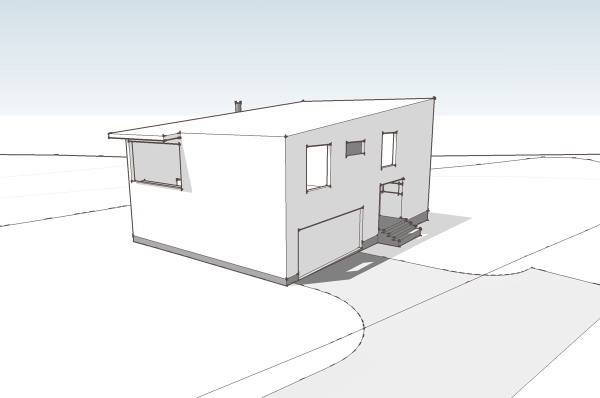 A mulit-level interior space within a simple geometric volume.
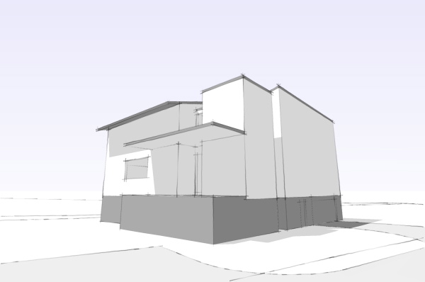 An inhabited wall defines the living space.
Technorati Tags: modern design, modern house


Those are some great looking sketches. I'm looking forward to seeing more about this project.
ReplyDeleteGreat stuff, Greg, as always.
thanks john. I need something to blog about that doesn't rely on customers sending progress pictures!
ReplyDelete