0751 Suburban House - first scheme
Today we'll look at one the schematic design ideas for this project site. This is the scheme described in the original posting as gathering the rooms around a high ceilinged living space. Today we will look at more views of the rough massing model, and a very rough floor plan of the house.
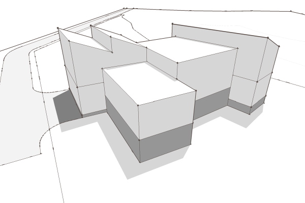 The image we saw in the first post.
click the link below to continue reading.
This scheme made an effort to "gather" the living spaces around the living room, making it a central hub of the house. Here is the ground floor plan:
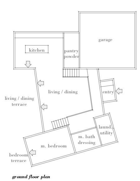 You note from the massing model that the bedroom wing which is opposite the driveway side of the house is a half level or so down from the living room level. The intention was to put the master bedroom on this lower level, increasing its apparent distance from the living spaces. The entry to the house from the ceremonial front was on this same half level below living, and the entry from the garage deposited you at the same place. So looking at the plan, the entry hall across the front of the house narrows where it turns towards the master bedroom, a door to the suite not shown on this plan. If heading up from the entry you come to a corner where the door from the garage would be, while you were offered views into the living space through a screen wall of some sort. The stair up to the living level brings you to the corner of the kitchen work space under a lower ceiling. The higher ceiling in the living space ends in a large windowed wall with a terrace beyond. The splayed geometry of the house is generated by the site, and has a nice effect of opening the house to the landscape. At the far end of the living room is the stair going up to the bedroom level.
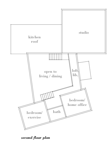 Now here on the second floor plan you can see how the secondary bedrooms overlook the living room. The idea would be that they could have sliding panels, or internal openings that made them like a loft overlooking the living space - remember the master bedroom below is a half level down, so these bedrooms are only a half level above the living room. A bridge like connection spans over the entry hall below bringing you to the studio space which sits above the garage. The circulation in this scheme is deliberately circuitous - it wraps around the living space like embracing arms. This was part of this effort to gather around the living space, expressed in another dimension, through the circulation and motion through the space.
Several other views follow.
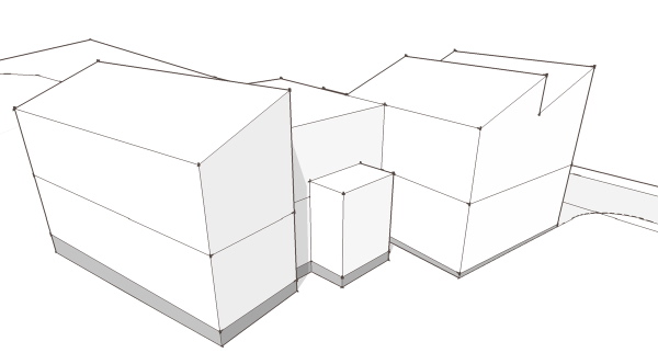 Fill that would be required is not shown in these masssing studies, so the floor level can be strangely off of what would be the final grade.
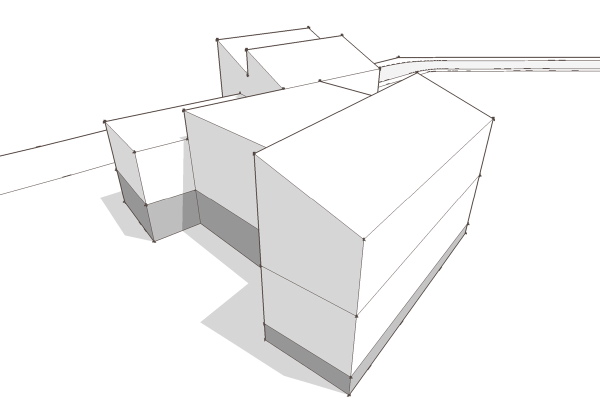 The rear terrace here would create an outdoor place at the level of the living room floor, which is not reflected in this rough mock-up.
So that was the first design idea. Ultimately it was abandoned for a number of reasons, but I still find the central living space and its relationship to the surrounding rooms compelling. The lower level master bedroom is also a great adaptation to a sloping site, but a site that slopes side to side rather than front to back.
Technorati Tags: modern design, modern house


I like the splayed layout. If this was oriented towards the south you could really catch a lot of sun and heat during the winter along with maximizing the views.
ReplyDelete