A very interesting hillside house design
A design for a hill side site by a good friend.
This is a house built by a good friend Peter Wong, in Charotte, North Carolina. Peter and I worked together in the office of an architect by the name of George Yu in Philadelphia. Peter left there to teach and settle in Charlotte, and I continued on practicing in Philadelphia. Peter eventually built a house for himself, and now his family, on a difficult site that slopes down away from the street.
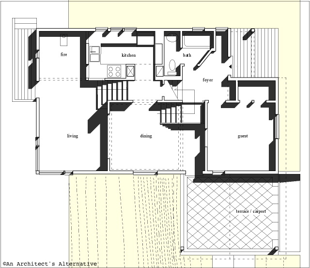
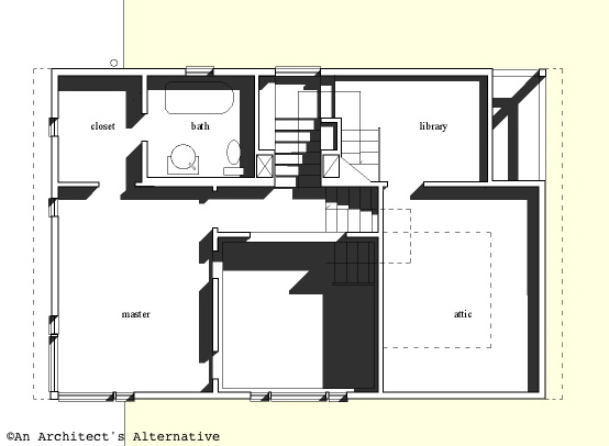
The house follows the slope of the site down with a series of interconnected rooms. Essentially it is a 3 bedroom, 2 bath house. The spaces are arranged such that they can serve several functions. The design supports use of a living room/dining room arrangement, or a living room/family room arrangement for more casual living. You enter the house off the street at the level of the first bedroom (which can also be a study, or guest room). From this level you descend to the dining space and kitchen level, and then to the living room level at the rear of the house. If you ascend from the entry you first come to the master bedroom level and its bathroom, and a stair continues up from there to a third bedroom. Along the way up is a library or study room that comes off of the landing of the stair. This last bedroom also has a small private alcove which again offers many possibilities for use. Unfortunately I don't think this upper level is shown on the plans. Most of these spaces are interconnected by openings that allow you to look from one to the other.
 plan of the lower levels
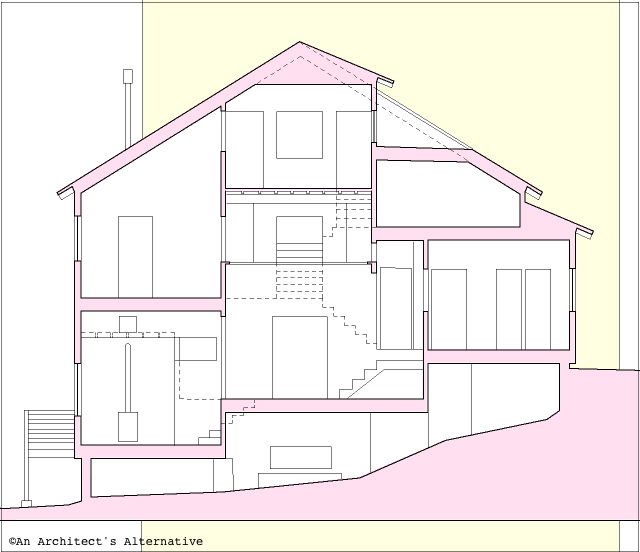
Peter has made a great study of Austrian architect Adloph Loos, and the design of this house reflects the multi-levels and intricately interwoven spaces that typify Loos' work. I find that I can look at this plan time and time again and be fascinated by imagining the spaces and moving through them. The section drawing below is a great aid in understanding the plan.
Peter built this house, could be 10 years ago, I don't remember exactly. He needed to be very efficient to meet his budget, and at the same time satisfy his creative drive. Essentially he was dealing with the same issues that we have at hand in trying to make modern more affordable. The overall treatment is contextual, but the use of cladding thoughtful, and the massing of the house unusual. The arrangement of the interior spaces is where the house is most fascinating.
 plan of the middle levels
Why am I showing this? Because I love the house and want to share it here. Also because I am trying to convince Peter to offer the house as a stock plan through my site. As you know I have created all the designs on my site, and I have been reluctant to offer anybody else's designs as I would want the quality to be on a par with my own, and I am very critical in this regard. Peter's work is intellectually rigorous as well as grounded in construction. I would be thrilled to see his work on available as it would give him a lab for his ideas and allow us to see them executed on a wider basis.
 section drawing of the house
What can you do? Let me know what you think. If you don't understand the plans of the house, then ask me questions and I'll try to clarify. I will try to get photos from him of the exterior of the house as well, because after all this is already built.
Technorati Tags: house plans, modern design, modern house


No comments:
Post a Comment