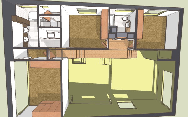
working slowly through the house - XHouse1
categories:
0862 XHouse1,
design issues,
modern house plans
Painting materials, adding doors, closet cabinetry, plumbing fixtures, slowly moving towards Design Prints.

Painting materials, adding doors, closet cabinetry, plumbing fixtures, slowly moving towards Design Prints.

Posted by
lavardera
at
1/21/2009 12:12:00 PM
![]()
Not related, but I was wondering if it would be easy to adapt a 3030 house plan to 20' x 20' x 20' dimensions. Here in New England, zoning is tough and I would like to stay within the dimensions of my current garage. When you get a chance, let me know.
ReplyDeleteSean, yes and no.
ReplyDeleteThe floor plan of the 3030 has a stair in the middle of the house. If we took 10ft out of the width it would make the rooms on either side too small. So the 3030 design really can't get 10 knocked out of it.
But there is no reason why we can't design a 2020 footprint house - the stair in all likelihood would need to be at one side or the other.
That's one bright green for the living areas! Who needs coffee, eh?
ReplyDeleteHow do you feel about the fenestration for those space? It's hard to tell from the angle of the model. Are you pleased with them, or still in progress?
Green? Must be on your screen because its more of a tan, maybe leaning a little towards olive. That's just the default color, the place holder until I "paint".
ReplyDeleteThe rough openings are placed for now. When I start filling in the window frames it could cause me to make some adjustments. We'll see.
Huh. Well, wouldn't be the first time that I've seen significantly different colors across monitors. My screen show it as a fairly bright chartreuse. Makes me stop and wonder what some of the images I've posted look like on other people's monitors!
ReplyDeleteGoing back to window placement; It seems that this design doesn't really have a blank wall for furniture.. I see the side of the room with the stairs that you enter in on, the kitchen side, which is fairly open, although a 1/2 level above. The opposite, I think, is mostly glass, and the wall opposite the stairs has a nice accent bay with a single window.
Where does a minimalist place his furniture and TV I wonder? I guess a die hard doesn't have one, but I doubt most people live that way.
:P
Just curious if you've given thought to a furniture layout for these spaces..
The upper level of the living area is the kitchen so that will have a kitchen cabinet at the left hand side, and the rest of the space will be filled with the kitchen island and the dining table.
ReplyDeleteThe lower level, where you mention the steps coming up from the entry will have a seating group, either two sofas, or two chairs opposed from a sofa, with a fireplace located in the bay. This will be the "conversation" area of the living space. i like the idea of chairs better because you can move them around on the spur of the moment.
Under the master bedroom, not visible in this image, is the other half of the living space. This will be the "media" area, with a solid wall on either end of the room, a sofa and perhaps one chair or two if they are light, and media furniture whether a wall unit or a low cabinet with video on top at the other wall.
I think in the 30dec post you can see the two spaces better in the images.
Ah, yes, I can picture it now. Interesting that you have chosen to define the main living area through the volume of the spaces and the intended furniture placement instead of physical separation. I think that works well. I do think the tendency would be to primarily use one area over the other, but I guess it depends on the activity taking place. Not that a physical separation would make that any different, or is something I am even recommending- (just thinking out loud).
ReplyDeleteI can't quiet picture how the fireplace is going to work in it's bay. My guess would be an external firebox with the minimalist flue going vertically past the exterior window above it? I may have misinterpreted your intentions there.
I think the openness of this plan is so fantastic. The climbing staircase and multiple levels make that a space you just want to experience!
What about a balcony in the bedroom that looks back at the kitchen? A simple, shallow juliet with some french doors that open.....? Ah, but that's the primary bed wall, isn't it? I guess you could go with an internal window over the bed, but I might be trying to get too clever here, opening up the public and private spaces to each other too much. Ah well.
Very nice layout regardless of my miscellaneous ramblings!
Chris - thank you for your enthusiasm. From your comments I can tell that you do understand the space. The living room footprint is divided by the change of ceiling heigh which defines two different characters, one more intimate and dare I say cozy. The other more open, and out in the public space of the house given the circulation that wraps around it.
ReplyDeleteThe kitchen/dining area is under the same ceiling as the public part of the living room, but on a level up - so this is another way of space making. The interest in the house comes from this overlap of spaces.
The fireplace will sit in a volume that all but fills the bay, the chimney will go straight up through the roof of the bay. I'm going to detail it out with wood storage in the space flanking the fire box. But it would live just as well with a danish stove sitting on the floor of the bay.
The idea of a balcony from the master is tempting, as it brings that voyage through the house to resolution and completes the connection. But I worry about losing the solitude of the master bedroom, and on a practical level sound finding its way through any opening short of a door with weather-stripping. You are right - the bed goes on that wall, but there could be two small "windows" at the side tables?
I appreciate your thoughtful comments - thanks!
I was just curious if you are doing you're modeling work in sketchup. I use it extensively for exterior modeling - but only as vignettes on interiors (not the entire interior).
ReplyDeleteYes Ron - I'm using SketchUp, and I do model the full interiors of the designs - but no framing members or foundation wall, nothing that you would not see from being in the house.
ReplyDeleteRon - I like your plan collection. Well done traditional designs, not the typical mcmansiony house plans. I'd love to see you get involved with CORA. Please check out http://www.corarchitecture.org/ We have a forum messageboard at http://coragroups.org/forum/
Can we purchase the sketchup models? Or can you produce a walkthrough video?
ReplyDeleteMy wife needs to really see every angle to enjoy your design as much as I do!
Kevin, no I don't distribute my CAD source files. Until there is someway to control digital copies it does not make any sense.
ReplyDeleteAs far as a walk through, I don't typically post walkthroughs of my designs, but it may be something I add to my catalog at some point. In the meantime however I did post a walkthrough of a very schematic version of this design. It gives you a good sense of the space:
XHouse1