
Hus1 goes live - Design Prints available now.
categories:
0860 Hus1,
design issues,
modern house plans
After a few weeks of preliminary images the work is finally done and the 0860 Hus1 design is now live on the catalog site. Design Prints are done and available via the ordering buttons on the catalog page.
 The Hus1 is also the first design of our new collection, called the Blueprints Collection which will focus on mid-century inspired home designs. You can read a little bit more about the new collection on the Plans page of our site, and on the new Blueprints Collection page.
Technorati Tags: Hus1, modern design, modern house


The front really needs some projecting shelter for the front entry. It think this was one of the worse things about that period. You have to install ugly gutters or a diverter. Rain splashes on the little concrete step - so a glass storm door or fiberglas door will be necessary. Sill rotting will also be a problem. I though the principles of welcoming spirit and neighborliness had been learned from a "Pattern Language", FLW, and 'The Not So Big House'.
ReplyDeleteI'm sorry anonymous, but you are misinformed. The oversized roof overhangs provide more than enough shelter for the front door, so go for wood or a storm door as you wish. And while the deep overhangs make it possible to forgo gutters a length at the front walk or a diverter is prudent.
ReplyDeleteAs far as sills rotting or issues of welcoming and neighborliness, you are jumping to wild conclusions.
Boy, apparently someone doesn't like this house! I actually think it is very well designed and love the retro feel. Although the one house I am still waiting for is the Studio Case House although it's not something I'd be building anytime soon, so it would be more for dreaming at the present time...
ReplyDeleteKeep the good ideas coming Greg!
I don't hate - Love the end gable windows and back. It was just the front. Maybe another view would give us a better idea.
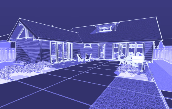
ReplyDeleteGreg, as a fellow designer, I enjoy reading your blog postings regularly and admire your work and style. While I understand the intention of your choice of rendering style with the Hus1, I wonder if the blueprint color scheme and extensive hatching may be distracting to potential clients. To me, the rendering style you used for the Hus1 is much more difficult to read than the funky graphic style of your original plans.
ReplyDeleteAndrew
That is a good question Andrew, and I'm certainly going to be interested in feedback from people as they look at the drawings. I had a big debate about this in my mind before deciding how to represent the houses and went through a lot of trials. Essentially I've introduced a lot of noise to what could otherwise be an image as sharp as I've used in the past. The question is does that undermine or reinforce the representation of the house?
ReplyDeleteThe conclusion that I came to was that although these blueprint style and halftone screen style images are less sharp than my original design images, all these image styles are so far from photo real that it really does not matter much. They all come across as drawing styles and I believe that the observer can distill just as much info from either one. However on another level the blueprints and halftones are evoking other feelings - nostalgic perhaps - that aligns with the design themes of the houses.
That's the thinking at least - and I'll revisit it if I believe its an obstacle. But my experience of advertising tells me that clarity is rarely the focus of selling. A little distraction may not matter.
What about a garage or even a carport? While we really like the house design, we don't see a convenient place to put a place to park cars, and just a driveway like in the drawings wouldn't work for us.
ReplyDeleteFor me, the drawings are neutral as to whether I would want to explore further building the house. While I kinda like the drawings, I would like to see sharper versions as well, but it wouldn't/doesn't affect my interest in the house.
Early on I imagined it with a carport in front, long enough for to cover one car, with a shed along the side towards the neighbor.
ReplyDeleteIn the end I thought it might be so site specific that it would make the house appear as if it would not fit in many situations, so I decided to leave it off of the representations. Maybe its worthwhile to include it in the Construction Prints and add a supplemental image to the web page that shows it in place.
BTW, the house as mocked up includes a detached garage at the back corner of the lot. Its not really shown in any of the views, but you can see it over the top of the car in the view from standing in the driveway.
Good feedback all around though - thanks.