Here is a link to a recently held design competition for Florida home designers. Its very developer oriented, and the house designs reflect that, but what is remarkable is that many of the designs shown as the "best of the rest" are overtly modern.
The Florida Homebuyer Home Design Challenge
On one level I'm very gratified to see modern shouldering its way into this mainstream platform. At the same time I'm discouraged because the homes, while modern, seem to have the same issues as typical developer homes. They are dressed modern, and some I think look nice, but they are bloated and pseudo luxurious in a way that makes my skin crawl. Its not just look and feel, its statistical as well - there is an alarming bedroom count to square footage ratio in most of these homes. 3 bedrooms in 3,500 sqft?
The discussion of "modern" on LiveModern all the way back to the Dwell messageboards always involved doing more with less, as a lifestyle, as a design dictum, not even driven by sustainability, but as a personal value and as an aesthetic. This stuff is really stepping on that for me.
What do you think? Please check out the link and comment.
Technorati Tags: modern design, modern house
Continue reading "The Florida Homebuyer Home Design Challenge"


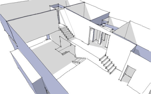
 I have to confess that I find the space really interesting, but no doubt it won't be for everybody.
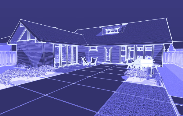
 The Hus1 is also the first design of our new collection, called the Blueprints Collection which will focus on mid-century inspired home designs. You can read a little bit more about the new collection on the

