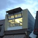
Saturday, March 06, 2010

Contest entries to vote for - our recommendations

In our last installment of our House Design Contest blog entries we described what we thought were the important characteristics of a good house plan product. Lets look at some of the entries that live up to this. I believe they are significant because they roll together the best aspects of creating a product and creating good architecture at once.

Of course our first choice is our own design entry, the Lagom House.

The Lagom house is pushing the boundary in size, coming in several hundred square feet less than most other 3 bedroom homes in the contest. Obviously this will limit its appeal for some, but also extend its reach to many who can not afford to build an extra 300 sqft. Please vote for the Lagom House here.

See the rest of our choices after the link below.

Moving on to my favorites I would like to have you look at the Duval design by Content Design Group. This understated design is successful on many levels.

Here is a modern house that fits well in existing traditional neighborhoods as well as sets out a pattern for developing new neighborhoods of similar scaled and priced homes. In fact this would be an ideal neighbor to the Lagom House. The Duval makes good use of the site by creating a central outdoor space, a courtyard enjoyed from the main living space in the center of the house. The rear of the property is reserved for work - parking from an alley, gardens, and yard work tools. Have a look at it, and vote for it here.

Next take a look at the design by freelancer Tim Brennan. He has created a small 1136 sqft home, one of the few designs in the contest smaller than the Lagom House. Two bedrooms with a garage within the footprint, his subRural House design has a scandinavian austerity to it that really appeals to me.

I like this design, I like its restaint, and I like the way he has represented it in a range of situations. This house design is a good house plan product, and a size that is sorely lacking in the market. Give it a vote here.

Next I'd like you to take a look at the equilibrium house by the same named design office in the UK. In some ways this house breaks some of my rules. The dense placement of freestanding homes is a pattern once common in our cities, has largely fell out of use. More common in the US are attached "townhouses", or detached homes with wider spacing. But the pattern suggested by the equilibrium is so nice its well worth my endorsement.

The staggered footprint of the house makes great use of the site. It allows for shallow lots, and therefore narrow blocks, yet wide frontage and rear gardens that is great for integrating the driveway and cars. The floor plan is smart, and even though a UK design they seem to have pegged US expectations. I think more study of US house industry could yield more feasible cladding and construction. But I'm cutting slack here because I so like the overall design. Check it out and vote for hit here.

Next I invite you to take a look at Rober Swinburne's Simple House. Sinburne is from Vermont and his design takes into account many of the issues faced by homes located in colder climates, and as a result energy conservation is definitely on the plate here.

The Simple House is a good blend of modern and traditional sensibilities, such that a home buyer looking for a traditional house, or a home buyer looking for a modern house would probably both be satisfied by this design. I think that says a lot for the reach and appeal this design could have - I think it would be a very successful product. Construction is very conventional, and any builder could make this house without a blink. None of the edginess and design in your face of many of the other entries, but I can guarantee you that this design would outsell the other swoopy ones by a long shot. A contest winner? Maybe not, but a product winner, yes. Vote for it here.

Next have a look at the Transition House by Studio Interpretation Design. This is a house I could see existing comfortably in many US neighborhoods of homes of similar size. Its modern, it fits in a traditional neighborhood, and basically has its cake and eats it too.

It has a really nice, smart, rational floor plan, well configured for a narrow deep lot. The house would fit perfectly on a street of other homes oriented in a similar way - narrow and deep. This house could have easily been articulated with overt gestures, green lattice on the walls, wishful edgy technology, and other bells and whistles to win green points. Instead the design shows great restraint. It telegraphs the designer's understanding of what might really get built and widely adopted. This is a house that an average Jane and Joe could afford, and an average builder would have no problem building. Support it with a vote here.

Next is the Passive Solar House by Jason Roan. This was designed for the retirement house profile, so its only two bedrooms within its 1800 sqft. But its a simple and well laid out design.

Clearly something any average home builder can execute and do a fine job with. View it here, and vote.

Next have a look at the O-House by Modaby Design. This house has an interesting modular layout that allows the house to be reorganized to take advantage of sun exposure on different lots. Very clever.

The design does include a number of diagonal wall surfaces that could drive the cost up, but it would also turn out just fine if these were simplified by the owner and builder to meet a budget. The design of the house can stand up to that kind of tinkering. See it here, vote for it.

The next entry you should look at is Windswept by David Cox. This house has a great plan layout, with a car port that doubles as a shaded outdoor living space. The home office is also divided from the home which is a great feature if you find a home office distracting.

The scale of the house is realistic, and it just feels like something that can really be built. Vote for it here.

Next is the Nock House by Red Dirt Design. At a glance it appears too big for a starter house, but when you look at the plan it is composed of discrete part that could allow the house to be built in phases. The core of the house with living and bedroom spaces is a very reasonable size.

My favorite part of the plan is the slight angle between the bedrooms and the living spaces. Have a look and vote.

No doubt there are more good designs, but I've not been able to scan them all. But I want to encourage you to keep the points I described in my last post in mind when you vote on the site. Don't be fooled by wishful and fancy drawings. Lets reward the house designs that point a way to actually getting good design into your hands. Continue reading "Contest entries to vote for - our recommendations"

Friday, March 05, 2010

A critical look - what makes a good house plan.

As the voting in the Who's Next contest carries on I'd like to call attention to some of my favorite entries and make an appeal for you to vote for them as well. But before I do that I want to explain how I am looking at the entries and what I thought was important for a good design. The purpose here is to create a stock house plan - something for which I've strong prejudices. At the root of it a house plan is a different thing than a custom design. Here is what I think are important characteristics for a successful design for a house plan.

- A house plan ultimately is a product, and a good product must satisfy more than one customer. Architects are more accustomed to singular commissions, houses as very personal expressions of a client's vision of home. Predictably they have difficulty stepping back from that situation and approaching the design problem from the standpoint of creating a product. A good product has a target customer and aims to create strong desire in that profile. It can not be too general - balance is needed. Neither too esoteric, nor too bland to create strong appeal within a segment of consumers.

- A good house plan design must be feasible to build at market rates. If customers are to succeed in building the house then the design must anticipate realistic budgets. A small house intended as a "starter" can not require elaborate craftsmanship or expensive materials. Beyond feasibility the design must be resilient enough to retain its most important characteristics when built without the expensive details the designer may incorporate into their renderings. The salient properties of the design must transcend budget. When the builder substitutes vinyl windows for mahogany sash the qualities of a good design must still come through.

- A successful design must challenge and conform to american expectations, both at the same time. That sounds like a contradiction, but it is not. You have to know the rules before you can break them is the classic way of expressing this. The way this plays out is that interesting designs often push the boundaries of convention, open your eyes to new possibilities, and propose compelling situations for living. When a designer does not grasp these boundaries the designs can seem random and out of left field, the intention unclear.

- The house plan design must be suitable for common site scenarios. Again, Architects are trained to look to the site, the orientation, local influences to guide the design and make a unique solution. While this can enrich a custom design, it also can make it unsuitable for sites with different conditions. A house plan needs to be flexible and adaptable to a variety of site conditions, particularly the ones that are common in the US.

- Enabling people to understand the qualities of a house design is very important for a house plan. Drawings need to be clear and accessible. Hand drawing, or computer drawing does not matter. Some people will respond to the romance of a hand drawing, but that is of little help if the drawings don't do a good job of describing the house, or worse if the "artistry" of a drawing contributes to making false representations. Hand drawings and computer drawings are both susceptible to this. I don't mean to single out hand drawings here, but I've never heard anybody express passion for a computer drawing. A hand drawing does not a winning design make. I'll just close this with the thought that obfuscating a drawing via indulgent complexity or color coding that adds no insight to the graphics should be avoided.

These are tough lessons, and run counter to many of the fundamental lessons of architects training. With all these things considered many of the most dynamic design examples in the contest miss the mark for being a successful house plan. Yet with the great number of people in the country its not out of the question that these could find a perfect match in somebody. Such is the world of house plans! In our next installment we will look at some of our favorite designs from the Contest and ask for you to vote for them.

Continue reading "A critical look - what makes a good house plan."

Tuesday, March 02, 2010

could not have described it better...

First day of voting, first comment on the Lagom House contest page, and it hit the nail right on the head. I could not have described it better, more clearly, or more convincingly. I just don't think these words would carry the same weight coming from the guy who designed the house.

3/2/2010 James: I voted for this home. After spending a lot of hours over the last few days pouring over the houses, I kept coming back to Lagom. There are a lot of really cool houses on this site, but most don't stand up to scrutiny. They aren't designed for real people in real families living in a real neighborhood. And given the number of exterior corners, floor-to-ceiling windows, high-end finishes and innovative (read costly) construction details I see, many of these “starter” homes would cost at least twice what Lagom would. This house offers the versatility needed in a starter home for young professionals. It's innovative, yet eminently practical and livable. It's inexpensive to build and maintain. It nicely combines public, semi-public, and private spaces. It easily provides more context than any other home in the contest. Other contest houses are probably more likely to be featured in Dwell and unhappyhipsters.com (check it out), but this home is the one that I could have afforded and enjoyed most when I was starting out. Good work, Mr. La Vardera!

This is a person who gets it, who understands what we are doing with the Lagom design. They understand that the point is not to design the house that has the most "Design" in it, but rather to design a house that people can actually build, that they can actually afford to build, and yet still inspire with its design. That's what we've set out to do, not only with the Lagom House, but with the entire Lamidesign House Plans venture. Its very gratifying to see somebody understand and appreciate it. Thank you James.

Continue reading "could not have described it better..."

The time has come to Vote Lagom House!

The voting has begun, and now is the time we humbly request your support. If you are a reader of our blog, a fan of our house designs, a customer past and present, somebody waiting for their chance to have a modern home, then please lend me your support with a vote for the Lagom House!


And after you have voted then please, a friend or family member that is also a fan of design - drag them in on this too! Send them a link and tell them to vote for your favorite modern house plan vendor, you know that cool house I was telling you about!


If you've not gotten plans yet, are still waiting for your modern house, or you are hung up with the economy, whatever stands in your way, this is a chance to be part of the story now - no waiting!


In the end this is just another bid by us for bigger voice in the housing industry, another step towards making the modern house more accessible to the people who want one. What we want to see is for small builders and developers across the country to witness the support for this cause, to see the fans and followers of a modern house plan vendor to receive such passionate support from people who are struggling to someday have a house like these. We want those builders and developers to sit up and notice that there is strong and passionate demand for this kind of house, and it would benefit them to serve this market. Every single modern design entered in this contest can help in that regard, but we sincerely believe that we have the strongest voice - because of all of you.


So please - go and vote for the Lagom House. And browse all the entries and vote for all the ones you like. There are so many cool house designs here, it will make your head swim!


Voting is simple - click the button near the bottom of the page, enter your email and the captcha spam buster, you'll get a confirmation email with a link to click, and you are done!


Continue reading "The time has come to Vote Lagom House!"

Thursday, February 25, 2010

More photos of Serenbe Plat House

Architect friends from Content Design Group visited the Serenbe Plat House during a home tour and were kind enough to share the photos they shot of the house with us.

The Serenbe house is a highly modified version of our 0242 Plat House design, and not to forget our new 3 Bedroom Plat House plan set as well. Check out the photos as they did a great job of capturing many of the details of the house. See the photos by clicking through to the rest of the post.

Get the flash player here: http://www.adobe.com/flashplayer


Continue reading "More photos of Serenbe Plat House"

Friday, February 12, 2010

0970 Lagom House with front porch

The front porch that everybody has been calling for has arrived. We are in the process of readying the Lagom House Design Prints, and the catalog page, and as promised the version sold through our own site will include a front porch.


The front porch is much the same as front porches present in many of our other designs. I like the standardizing of these architectural elements across our range of offerings. The repeated construction of like details is what offers builders predictability and familiarity when they are building multiple houses.


The Design Prints will depict the Lagom House layout for the south side of the street. We will eventually expand this to include Design Prints of each of the configurations. But for now this will represent the range.


Continue reading "0970 Lagom House with front porch"

Thursday, February 11, 2010

starting a remodern movement from one shirtless dancing guy

I've often gone on here on the blog about the "ReModern Movement", my own play on words from the title given to the original Modern Movement. Its been meant to identify the more recent resurgence in popularity of modern style homes. It has not become much easier to get a modern home lately, but activity in the housing market has at least recognized that yes, there is demand there, and there are people wanting and waiting for a modern house. Putting a name to it - ReModern Movement - just makes it easier to package the idea when you have to explain it to other people.


So we have a movement! Well I came across this little video today, from a music festival, and used by Derek Sivers during his TED Talk to explain the dynamic of creating a movement. Lets watch:


So the shirtless wiggling guy, willing to make a fool of himself. That's me, and other pioneers in marketing of modern home designs in a climate where every builder & self proclaimed expert on houses will tell you nobody wants a house like that.


And the first follower? Thats you. And the other people who have gotten plans, and built houses, and exposed all their friends and families to a new idea of what a home can be like. Its eye-opening to them. They think you might be a little bit crazy too. But pretty soon your house is in a magazine, or newspaper, or on a tv show, and your friends are trying to get enough courage together to jump up and join the early adopters.


So keep dancing. Welcome the new adopters as equals, and welcome their friends. We are nearly a crowd, I'm telling you!


Continue reading "starting a remodern movement from one shirtless dancing guy"

Thursday, January 28, 2010

Contest House - taking the mystery out

There is no mystery to building a high performance house. You don't need unobtanium, you don't need the next greatest clever building material, and most of all you don't need to ask builders to reinvent their material stream and their business model. This is something we can do today.

I've mentioned the "Swedish wall system" numerous times as we've worked on the contest house. Its no mystery - we've shown how they build their houses in multiple posts here. So it is no big reveal to show how we are using this approach in the Lagom House. The principle is straight forward - deeper studs = more insulation. We are increasingly moving towards 2x6 studs in the US, so in the Lagom House we step up to 2x8s. This also gives us the opportunity to use staggered interior and exterior 2x4 studs as another step up of performance by eliminating the thermal bridge of the studs. Into this wall we will cram R30 roof insulation. It will need to be compressed slightly to fit, but its the best size readily available to fill the 2x8 studs. We top that wall off with a layer of foam insulation between the sheathing and the siding, again to break the thermal bridge and raise the total R value. Total estimated insulation value - R38.

Now this is not quite what is happening in Sweden. Their stud sizes are not the same as in the US and it appears they use something between a 2x6 and 2x8. Their insulation appears denser than our readily available batts. They omit the sheathing and instead are using a thick dense insulating board which appears to be able to take and hold nails from the siding. This along with heavy thick solid wood siding panels replaces the plywood sheathing that we use on our houses. This kind of panel is not available here, nor is heavy wood siding the norm. In its place we put readily available foam insulation panels over normal sheathing - nothing unexpected for the carpenters.

At the foundation we employ the "super" insulated slab on grade type system that is being used in Sweden. This is not used on every house there - again this is considered a step up from their normal slab on grade preparation. But the system of pre molded EPS foam forms is the same, and you can see how this is a progression of what they do on a daily basis. The perimeter grade beam is now separated from the floor slab yet still insulated. The entire slab now receives a thick layer of EPS foam below ensuring that the radiant heat goes into the home and not the soil. Considering the way we typically build foundations in the US, and how much effort and money goes into dumping concrete into a hole in the ground, I am very hopeful that some day we can redirect that effort and money towards a highly insulated slab as we see here.

How about frost and foundation heaving? This is always the concern and what has led the US to require footings extend below frost. Yet in Sweden where the winters are longer and more harsh than most of the US they build their houses without the foundations extending below frost depth. Why is that, and what are we missing? I had a conversation about this with an architect visiting from Norway where they use a similar technique. He said plainly that the ambient temperature of the earth below the frost line is much warmer than the winter air. This is well known - go down a few yards and the earth is about 50 deg, all year. Geothermal heating leverages this. Placing a home on top of the earth in fact shields the top layers of earth and permits that warmer ambient ground temperature to extend up to meet the house, and in fact prevents freezing of the earth directly under the foundation. Its plane and simple - the house insulates the earth from the cold and the natural temperature of the earth prevents freezing and heaving of the foundation. The house raises the frost line. The crushed stone bed that is laid as prep prevents wet soil and freezing from occurring directly below the slab, a well known principle even here.

But why not use SIPs, or ICFs, or straw bales, or any other number of promising building tech? Because 99% of the people building homes right now have never worked with any of that stuff. If they do it forces them to work with new suppliers that they have no track record with, it forces them to estimate time and schedule for work they have not done before and don't know how long it will take. It forces them to work with new subcontractors and learn new techniques. In the long run all these things are good, but in the short run it makes houses more expensive and greatly slows the distribution of energy efficient construction. What we are outlining here preserves all of the know how, the supply train, the business relationships, everything that is already in place. We already know how to do this, and we can begin building homes with near Passive House performance right now.

So there it is, a strategy for building high performance houses, TODAY. What are we waiting for?

Continue reading "Contest House - taking the mystery out"

Wednesday, January 27, 2010

Contest House - new contest images

We've created more progress images of our Contest Graphics, this time showing the front and rear of the house with people, and spinning wind generators!


The front yard much as we've shown it before, except for the owners talking with their neighbors that stopped by.


And the backyard again much the same except for the owner firing up the grill while the gals check out the garden.


We have also created a tile that discusses the ideas surrounding the layout of the yard, and our assertion that backyards should become useful again.


And we have added a tile to show the neighborhood, and introduce the plan variations for alternate street orientations for the house.

Continue reading "Contest House - new contest images"

Friday, January 22, 2010

Contest House - caving in to the romance of wind power

Its growing on me. I've got a fever, and the only cure is more wind power.


Yes - I am finding it harder and harder to imagine presenting the house without the wind generators. They just send such an overt message whether it makes complete sense or not. I have to get them spinning in the image.. Well anyhow here is the current state of the front yard. A large light has been added to call out the front door, and hold off the calls for a porch roof.


And here is the current state of the back yard. The rain collection barrels have been added at the right. The clothes line is already in use. And the veggie garden is going gang-busters. Unfortunately you can't see the compost bin in this view. Ok, time to fire up the grill. You can take those empties out to the recycle bin - rubbish court behind the garage.


Continue reading "Contest House - caving in to the romance of wind power"

Thursday, January 21, 2010

Contest House - progressing on site, stay with me

I know I'm going to lose some people here I'm sure, but this is where we insert real life into the modern house picture.


The lot model coming together. Still with the rough massing model but the major elements in place here. House is close to the front, minimizing front lawn and making more space in the back. A veg garden or chicken run if you will is along the back, along with our small drying yard with our favorite suburban icon - the whirly clothes line. Not visible behind the garage is a small work+rubbish yard. The wedge shaped garage sports a basketball hoop, and we have a decent size lawn for play or space for gardening. Immediately against the house and partly under the shelter of the deep overhang is a small terrace. Table and chairs can live outside the kitchen here, and a grill of course. Some more lounge like chairs by the living room completes the back yard.


Meanwhile out front we are tapping a host of domestic stereotypes without irony. A white picket fence lines the sidewalk. A useful divider I think when the front yard is fairly shallow. A front porch - terrace really gives you a place to watch the neighborhood, and yes I know this is begging for a porch roof. It will get one in our catalog, but do without I'm afraid for the contest. Some Adirondack chairs on the porch look welcoming. A few cars in the driveway - a thrifty Honda Fit, and a pick-up for those DIY projects and just moving stuff. Since this is just a progress image - screen grab, I am showing the wind mills just to amuse myself. I will be omitting them in the final images. But love their contrast with the rest of the domestic scene - ultimately this is the way it has to be, right? Our solar panels and flower boxes with have to live together, and more and more that is what will represent a complete domestic picture.


People - we need to populate the model with people. More about that coming.


Continue reading "Contest House - progressing on site, stay with me"

Wednesday, January 20, 2010

Contest House - a compact siteplan to match a compact house

As I am mocking up the site now, simply to serve as a background for exterior images of the house, I turn to some inspirations for suburban site planning that I think are still very relevant today.

Many years ago when I was still an architecture student I did a self-defined design studio project for designing a suburban subdivision. You have to realize how out of step that was with studying architecture. The suburbia, particularly residential suburbia was an architectural desert. Yet I took a semester to study how we carried out suburban development and the way we made houses, and suburban infrastructure. It was 1984 and most of my naive work as a student predated the New Urbanism movement. My project book is probably still on the library shelf in the architecture school library at Rensselaer Polytechnic Institute. Go look it up if you are curious.

Anyhow back then I dug into a few dozen "pattern books" - that would be catalogs of stock plans - from the library published in the 1940s. Just like today they were full of current as well as reasonable recent designs - things from the 30's and 40's. I was taken with the way they presented the houses, usually with all the plans and elevations presented on one tidy letter size page. Often the ground floor of the house was presented with a rendered site plan - hypothetical - but significant as it demonstrated how the house could be integrated into the site. In a word the site plans were wonderful. These were different days and suburban lots were much smaller than normal today, and the middle class expectation was smaller as well. Yet these siteplans presented a rich and functional environment for these house plans. I had copied some of my favorites from those books all those years ago, and this morning I dug them out of the file in my basement as they were on my mind as I worked up my site plan model. Lets look at them:

The first comes from a house plan simply titled Design for a Six Room House. How great is that! It is a 3 bedroom house. The first thing I should point out is the size of the lot is 35ft wide, and 125 ft deep. That is a small lot, unheard of today. The house has a front loaded garage, unusual for that time, but its near impossible to pass the house to a garage out back. So what do we have brewing in the yard? About half of the yard is dedicated to a Walled Garden. This garden is off the living room and is shown with some stone paving. This would be the extend of the pleasant outdoor living space. Directly behind it is a smaller yard, divided by the garden wall called a Playground Truck Garden or Poultry Run. Dig that - either a small yard for the kids to crash around in, or someplace for your chickens! Very practical. The other half of the yard is taken up by a long space simply called a Drying Yard. Two long clothes lines are shown with a paved walk between them. Again, how practical that you would dedicate nearly half your outdoor space to productive outdoor uses. I won't go on right now about the vilification of clothes lines in suburban America - its been looked down on as lower class and this is a grievous injustice. We all need to save energy, and experience the joy of fresh line dried items. Behind the drying yard is a small space set aside for rubbish and yard work implements - and horrors - a home incinerator! We actually have a relic of one of those in our own yard! All in all I love the purposefulness of these structured yards, and the way they serve the home - not as a burden to maintain, but as a working part of the household. The front yard is very small by comparison - just enough for some street appeal because after all that land has a job to do.


The next is called Design for a Five Room House - surprise! This time on a 30ft wide lot, again 125ft deep. But this design benefits from an alleyway with rear access to a detached garage. Again we have a main garden space, this time shared with play space. Behind it is a poultry or dog run. Yes, not that long ago many of us kept chickens! The other side is again dedicated to a drying yard, and a rubbish and work space behind it. So useful, so civil, so well considered. What has happened to us? A home bought today comes with graded dirt in the yard, if you don't spring for the extra sod. We have certainly lost our way here - all that land to tax your time, to maintain, but never giving anything back. And we all know that it so wants to! Chickens, or a small vegetable garden, enough lines to really dry all your laundry, a discrete place for tools and trash, and a limited area to enjoy as well as a limited area to manicure.


The last is a more familiar proportion lot at 50ft wide by 100ft deep. Nearly the same as our contest house presumed lot. Here they manage to pass the driveway by the house - much more willing to squeeze the driveway against the house than we seem to be today. In the back the drive widens to an Auto Court serving a two car garage at the back of the lot. Again we have a walled garden, a drying lawn, and a playground truck garden or chicken run. The front yard is very small, and the rear yard is maximized.


I think the practices we see in these old site plans suit our sustainably trending present. Living in the suburbs is a luxury, and a luxury that we can begin to pay for by using the given land to reduce our load on the world in other ways. Line drying clothes is a no-brainer. Composting kitchen scraps, and yard waste to use in the gardens, chickens sure, but perhaps a small vegetable garden will come in less conflict with regressive zoning regulations. A working space in the yard for trash and work bench and yard tools - and DIY projects. We can do this people. Its not some horrible sacrifice to live more sustainably. It is an incredibly rich, rewarding, and satisfying choice. And it comes with a backyard that Rocks!

Continue reading "Contest House - a compact siteplan to match a compact house"

Tuesday, January 19, 2010

Contest House - building context

The next step is creating exterior images of the house, in a schematic context - that means we need to build a little neighborhood.


The individual lot, compact, small front yard in order to maximize the rear yard. The detached garage provides some alternate storage in the absence of a basement. The house I grew up in sat on a lot this dimension - 60ft x 100ft, so I feel very familiar with the scale of this density.


While a neighborhood full of Lagom Houses is unlikely to start we'll present an idealized context. The houses on one side of the street are the second plan variation for the proper street+solar orientation. We will be replacing the lot in the center with a more detailed site model that has the more detailed house model plugged into it. This part should be fun. As the modern house is so often cast as aloof and minimalist we will strive our hardest to present it as domestic and lived in.

Continue reading "Contest House - building context"

Monday, January 18, 2010

Contest House - to show wind generators or not

Should the first image we show of the house have it topped with wind generators, or not?


Here we see the house with the wind generators - but the inside of the shroud has been painted white to reduce the contrast we were seeing in the previous image, or...


..do we dispense with showing wind generators for now and let the house forms stand on their own for the time being, solar collectors still in place.

I have to say that I think I like the interaction between the wind mills and the overlaying title letters, where as without them the house appears simpler and cleaner. But I tend to gravitate towards noise and complexity. We are still going to show the the wind mills in the image in Tile2 where we describe the characteristics of the house. Thanks for the great active feedback I've been getting all through this process.

Continue reading "Contest House - to show wind generators or not"

Sunday, January 17, 2010

Contest House - second tile

Doing more mocking up of presentation tiles today.

First draft of the second tile. We want to launch here right into the important characteristics of the house design on the second tile. A section cut-away begins to give us a feeling for the space inside the house, as well as the overall structure. The three strategies for making house lagom are described at the top of the tile:

- An efficient and compact house design that lives larger than its size.
- A platform for both active energy systems and passive heating & cooling.
- A highly insulated envelope that reduces energy consumption.


Here another draft of the first tile. I was not sure if I should present the house right here with solar panels and wind generators on the roof. I decided to move the roof scape up to be partially obscured behind the "Lagom House" title to subdue them a bit. I welcome feedback on this - should these alternative energy accessories be flying on the first tile, or should they be introduced as options later on?

Continue reading "Contest House - second tile"

Contest House - first tile

Beginning the presentation graphics for the contest.

The contest allows up to 9 images, and I plan on using all of them simply to increase the amount of info conveyed about the design proposal, to better explain the design. On the contest site they are presented in a grid of thumbnails which I am referring to individual images as "tiles".

The first tile is most important. You need to hook the browsers on that first tile into looking into your design more closely. To that end I want them to be able to grasp the house immediately - visually both floor plans need to be presented, and an image that captures the spirit of the house. Text wise I want to present them with the overriding concept of the home. We want to feed both visual and verbal browsers and entice them to click on to the next image.

The image here is a placeholder, and is obscuring the title text. The final image will have the house on a white background, with house in context images appearing elsewhere in the presentation.


Continue reading "Contest House - first tile"

Tuesday, January 12, 2010

Contest House - quick walk through the house

Take a quick walk around the house with me.


lagomhouse12jan10_01s


In the living room - I need to add some color to the foreground furniture, hmm..


lagomhouse12jan10_02s


Over in the kitchen - I think there is plenty of room even with a table.


lagomhouse12jan10_03s


Come upstairs to a bedroom - this is the master bedroom, not gigantic but fits a queen.


lagomhouse12jan10_04s


Upstairs hall - the window seat at the top of the steps, linen cabinet, and the homework desk.


Ok folks, its officially time for me to start lobbying you for your vote. When voting opens on the FreeGreen site I will be posting links and humbly asking you to vote for the Lagom House. Contests are to win after all, and even though this design will always make its way into our catalog it would certainly be nice to have a contest win as a feather in its cap. Stay tuned for me to beg your support.


Continue reading "Contest House - quick walk through the house"